Click an image to see it closer.
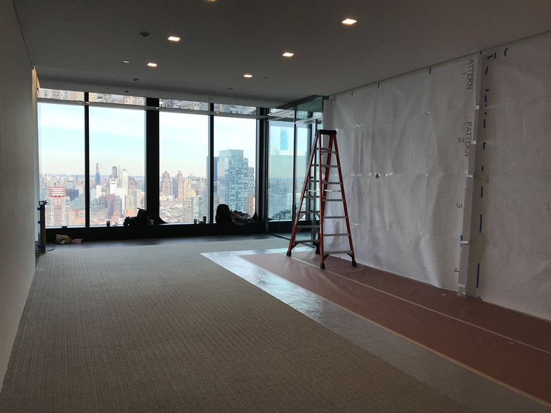
Mural. Working with Infinite Scenic for 55 Hudson Yards
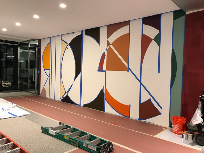
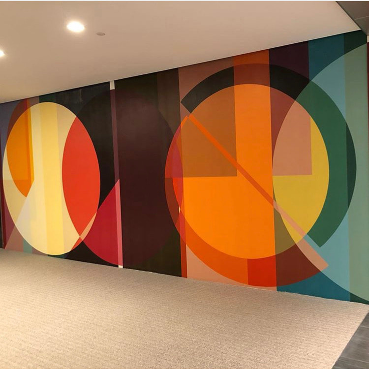
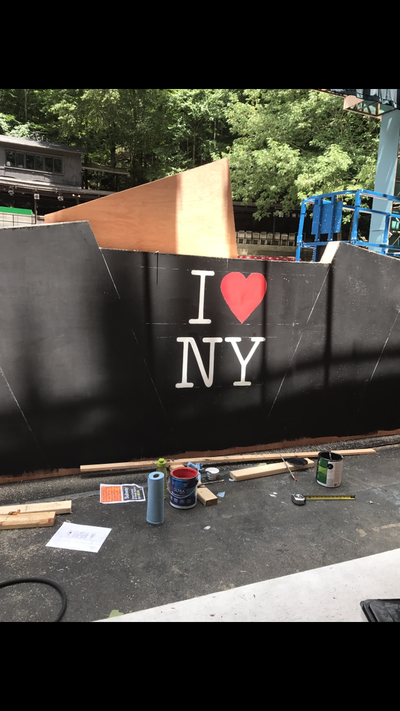
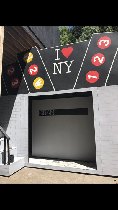
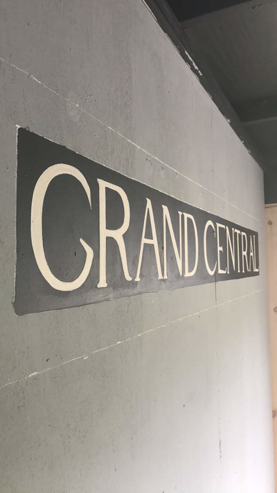
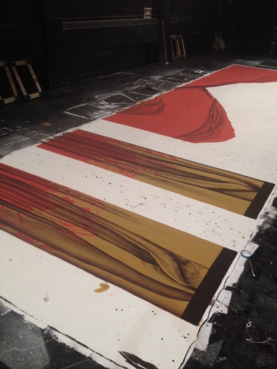
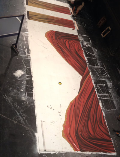
This mural was mapped out on the wall using a large pounce and charcoal rags. Me and three others taped out the shapes to add color.
Design by Pae White
This mural was mapped out on the wall using a large pounce and charcoal rags. Me and three others taped out the shapes to add color.
Design by Pae White
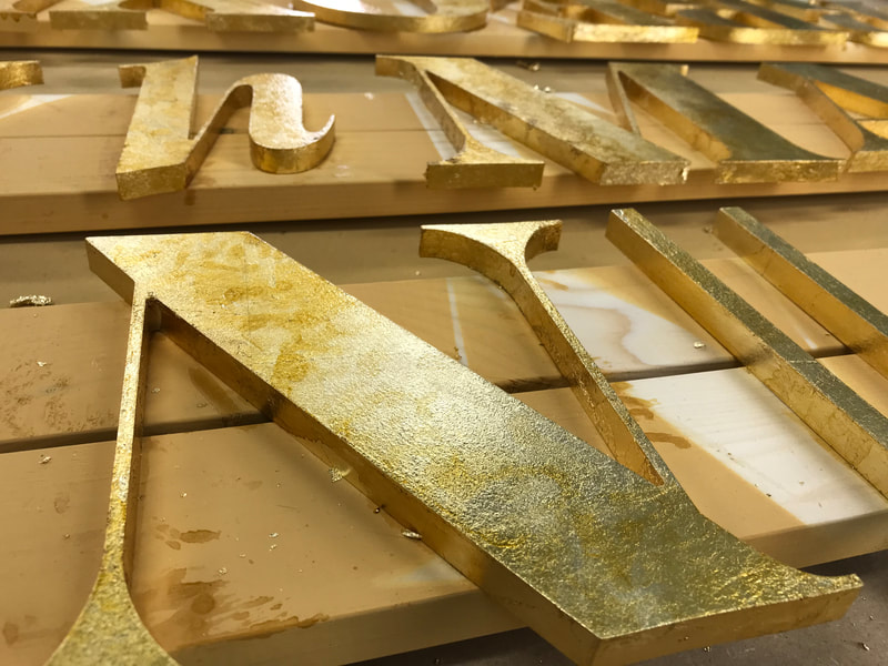
Gold Lettering. Working with Infinite Scenic for Glamour Magazine.
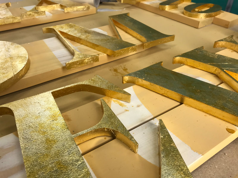
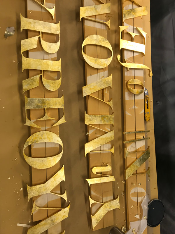
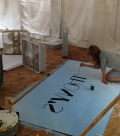
The letters were cut on a cnc out of mdf. I applied Wunda Size with a brush and small roller and waited for it to get tacky before the gold leaf was applied and burnished with a soft brush. A clear and amber shellac was added over the gold leaf with a brush and ragged over for a slight aged affect.
The letters were cut on a cnc out of mdf. I applied Wunda Size with a brush and small roller and waited for it to get tacky before the gold leaf was applied and burnished with a soft brush. A clear and amber shellac was added over the gold leaf with a brush and ragged over for a slight aged affect.
Character Murals for Pips Island
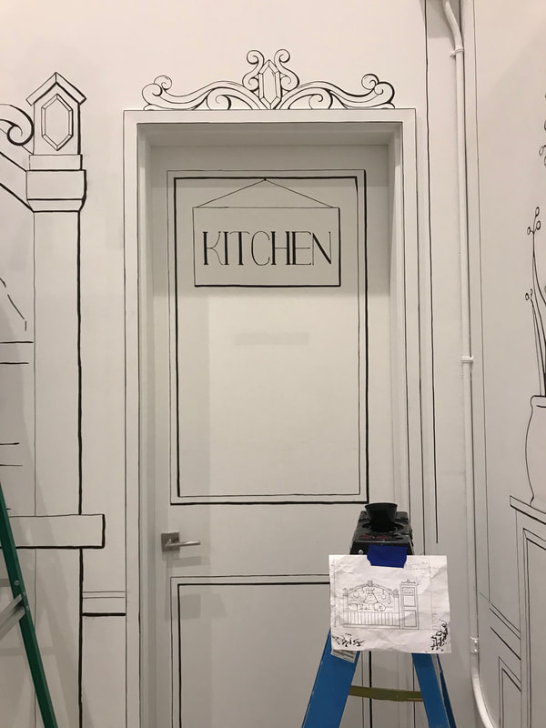
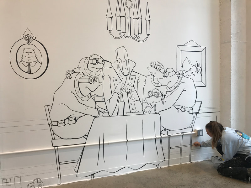
All lettering and images above were drawn by hand from an image to scale using a scale ruler and a tape measurer. No projections were used due to the shape of the room. I first used vine charcoal. Then a mix of staples brand "sharpies" and black latex paint to line out the images.
All lettering and images above were drawn by hand from an image to scale using a scale ruler and a tape measurer. No projections were used due to the shape of the room. I first used vine charcoal. Then a mix of staples brand "sharpies" and black latex paint to line out the images.
Working with Hudson Scenic Studio for Disney Cruise Lines Frozen the Musical
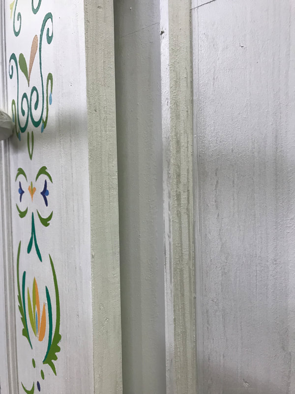
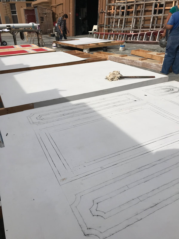
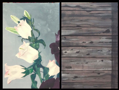
A chip brush was used to apply a light glaze. A rag was used to drag the paint into grain lines before flogging with a flog brush on these doors.
A chip brush was used to apply a light glaze. A rag was used to drag the paint into grain lines before flogging with a flog brush on these doors.
Million Dollar Quartet coming soon to the Pacific Conservatory Theatre.
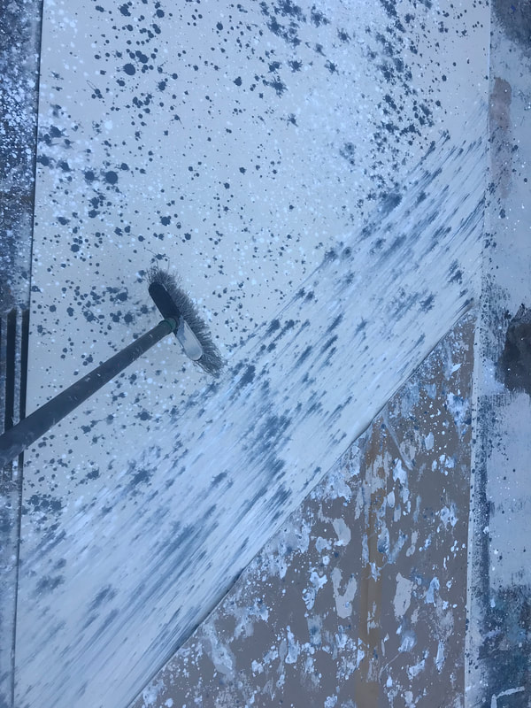
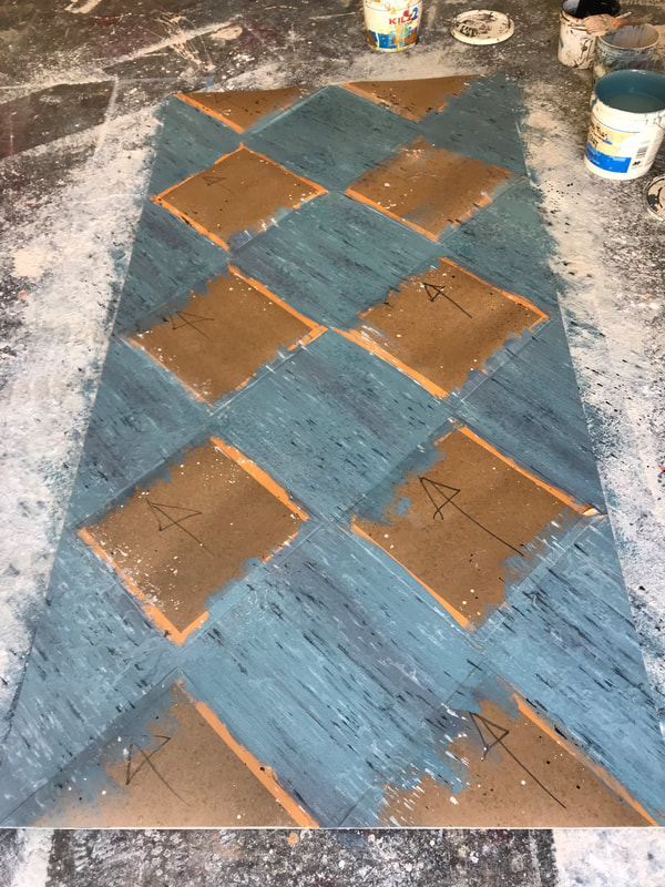
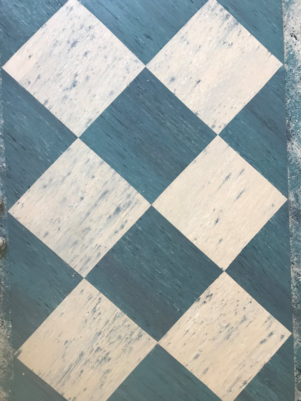
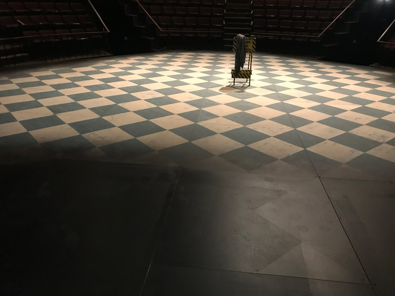
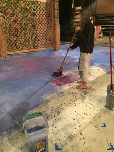
The top row here shows a painted linoleum done by using a broom for a spatter drag and waiting for the paint to dry before masking off squares to paint the blue spatter drag in the opposite direction. A pneumatic cup gun sprayer was used to fade out the edges of the stage to black.
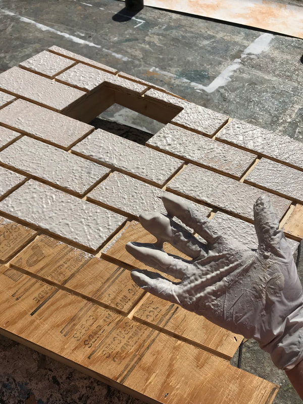
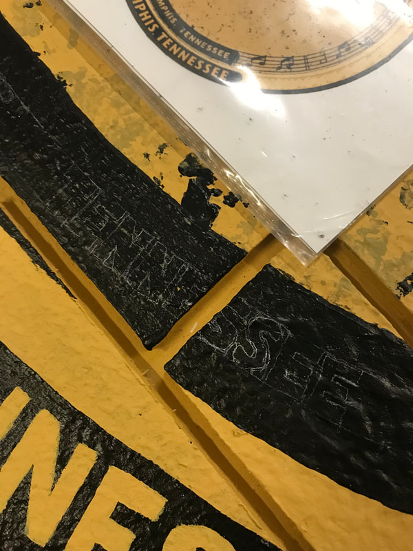
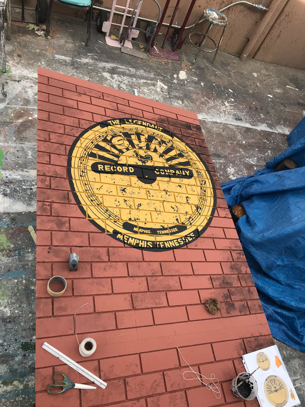
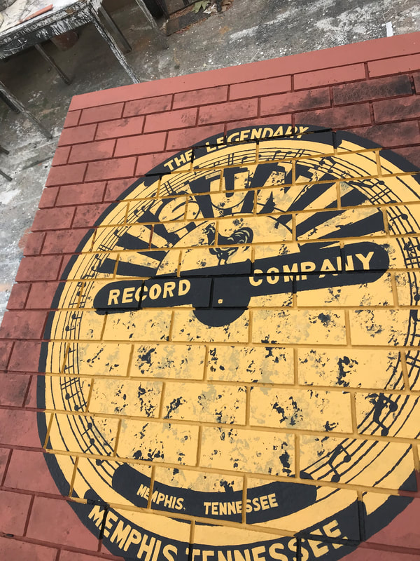
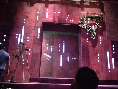
The second row shows a sheet of plywood with its surface cut by a cnc router into the brick pattern. I used joint compound mixed with glue to texture the surface before painting the record company sign using a handmade compass and hand lettering. In the lower second photo you can see how I like to space out and draw in the small letters.
Scenic Design by Kent Homchick
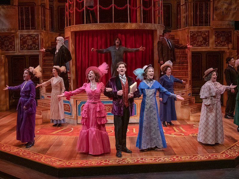
A Gentlemans Guide to Love and Murder
The Pacific Conservatory Theatre
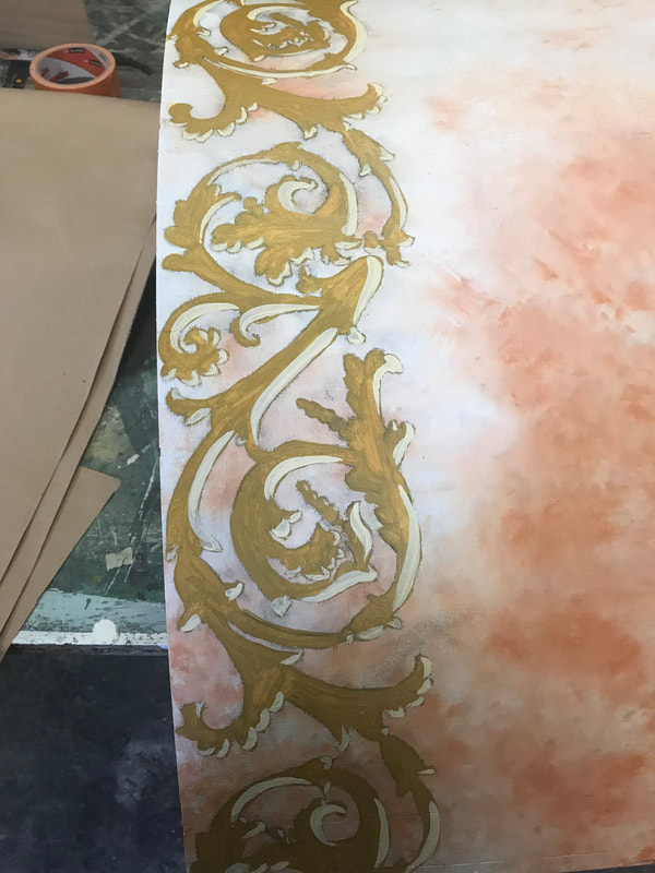
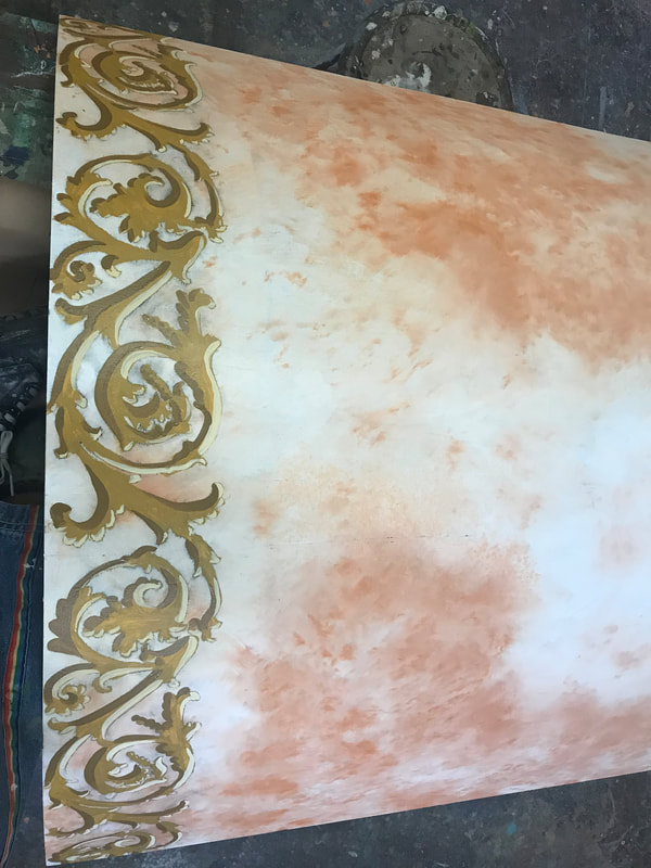
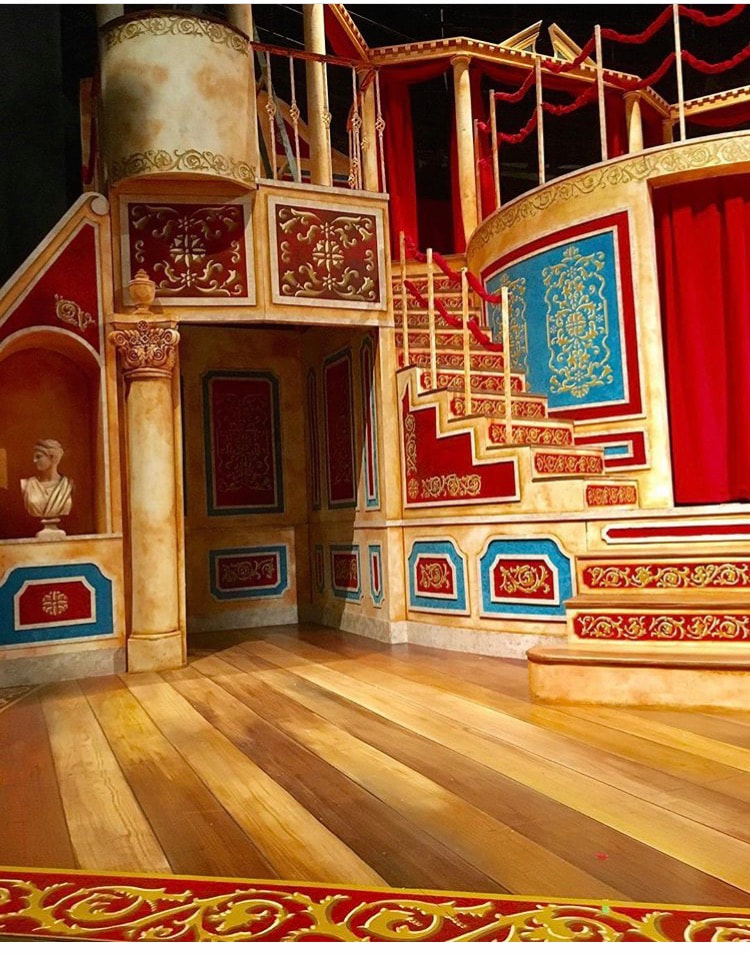
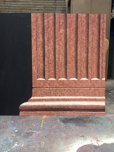
The peach colored marble was painted by sponging the darker color over white paint and blending it with a soft bristled brush. Layers were added and blended in to create depth. The lower right image is the peach marble in process.
In the image at top left we used the paint elevations to draft out the different colored sections.
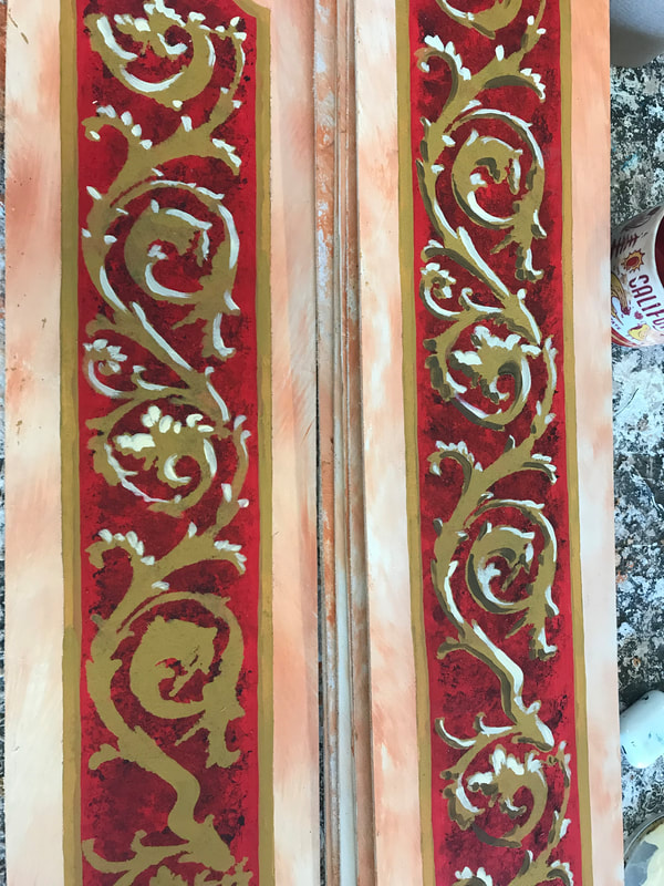
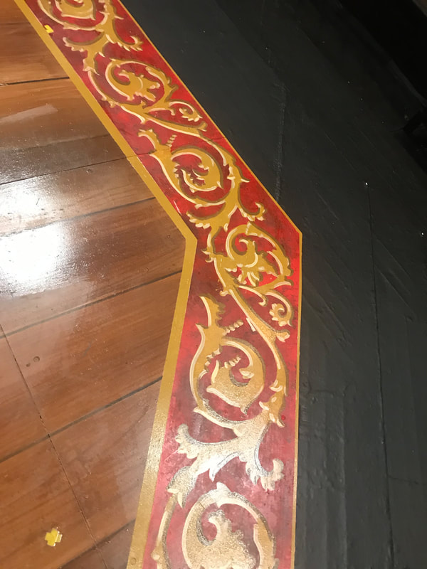
The scroll pattern was pounced onto the dried painted surfaces and then painted in by hand with added highlight and shadow. The top center image is the scroll without shadow and the lower left image has sections of scroll before highlight and shadow were to be added.
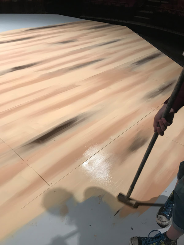
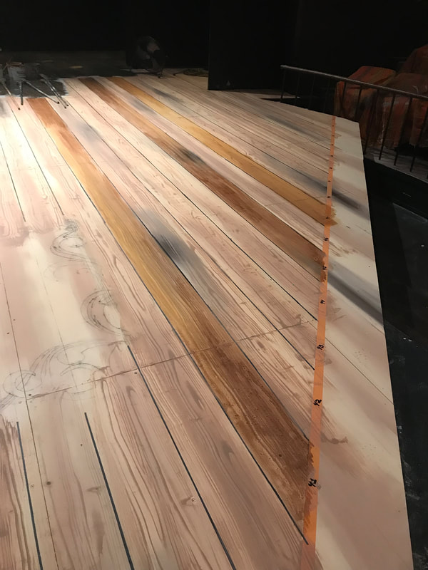
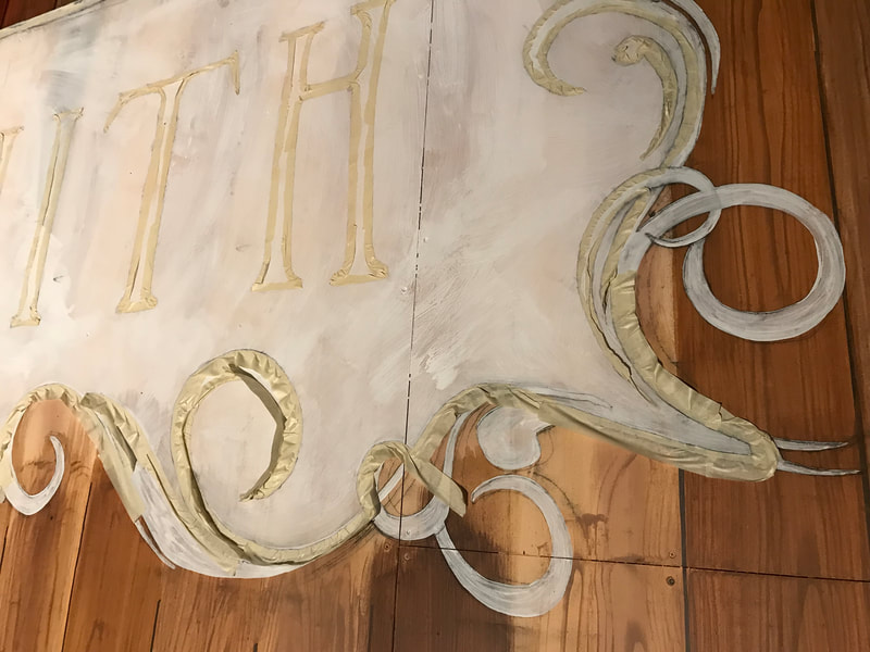
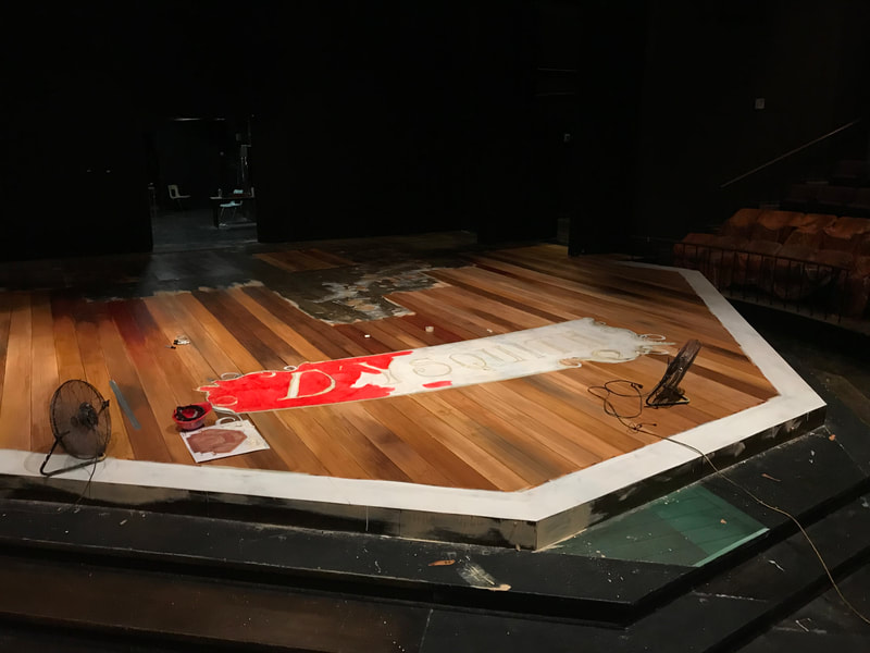
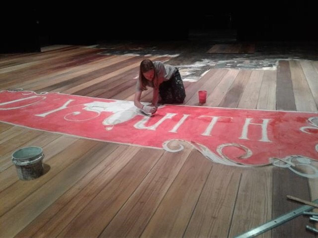
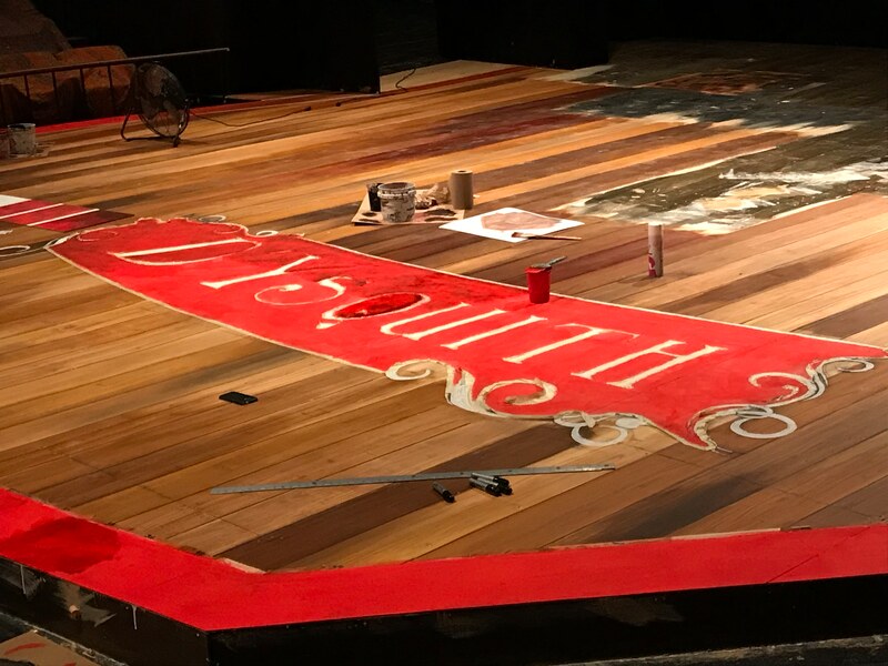
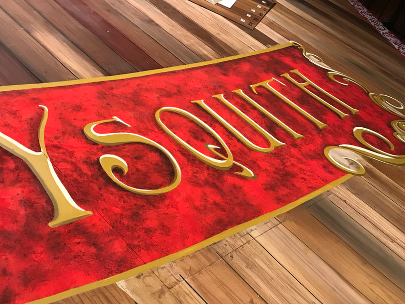
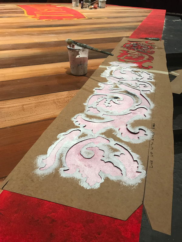
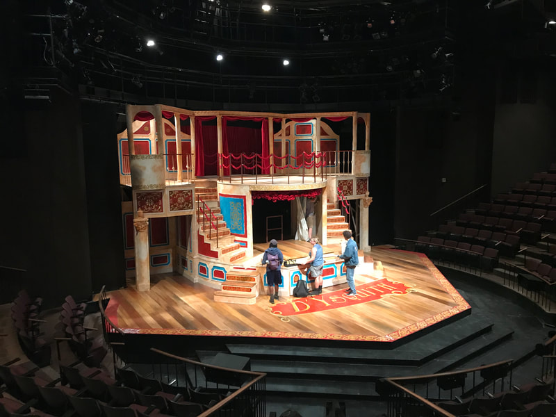
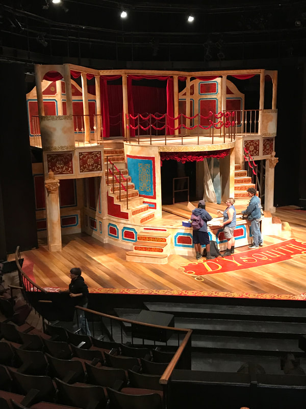
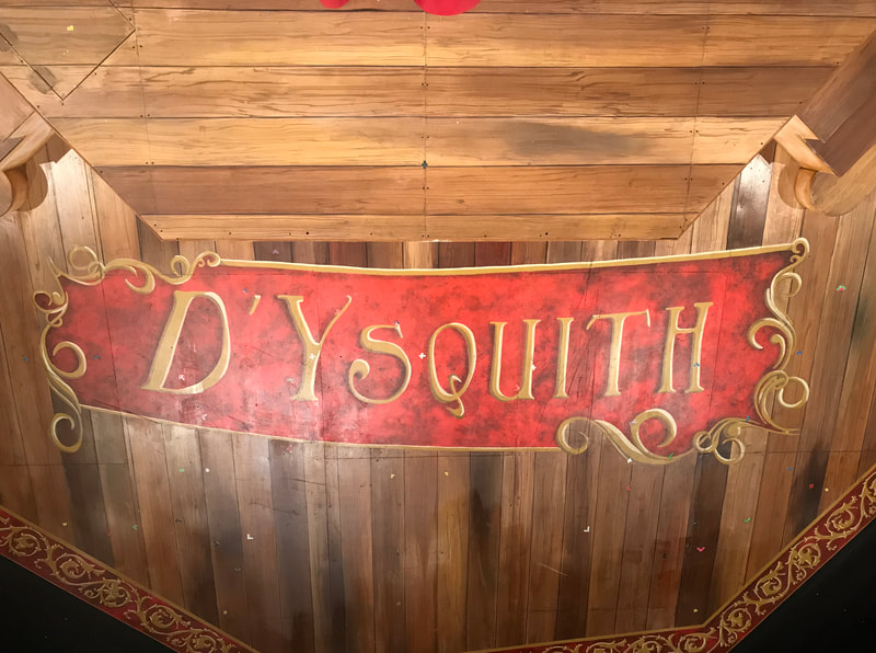
To paint the floor for the production of A Gentleman's Guide to Love and Murder at the Pacific Conservatory Theatre a team of three other artists and I began by painting a light wood colored wet blend as seen top left. We then added plank lines with fat sharpies and lining sticks. The lettering for the name Dysquith was pounced in place before adding sharpie. Wood graining tools were used on the planks with washes of different wood tones added over each plank. I taped out the letters of Dysquith and painted them in. Another stenciled design was added to the downstage edge of the stage with highlights and shadows.
Scenic Design by Jason Bolen
Lighting Design by Jennifer 'Z' Zornow
Costume Design by Eddy L Barrows
Scenic Design by Jason Bolen
Lighting Design by Jennifer 'Z' Zornow
Costume Design by Eddy L Barrows
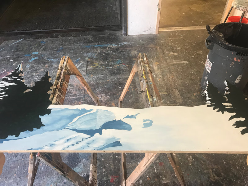
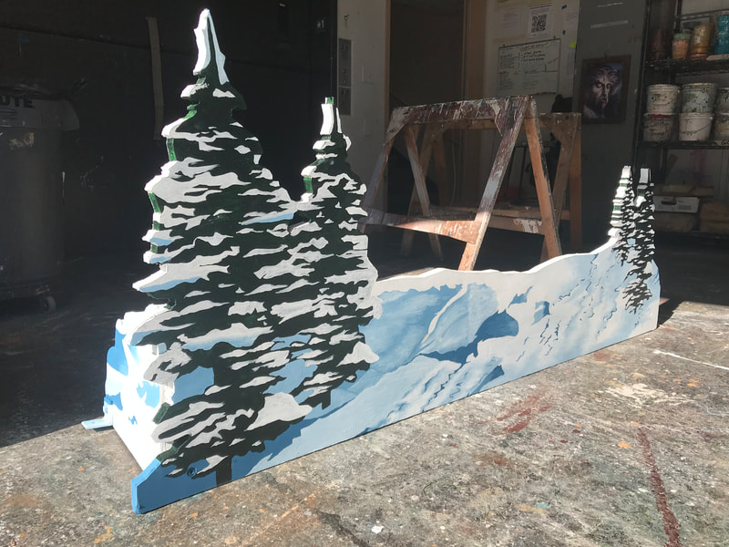
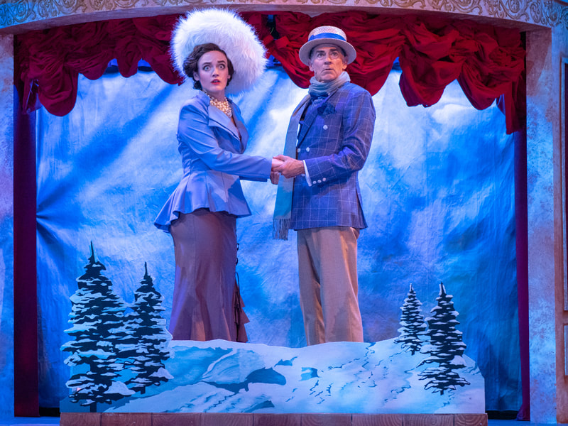
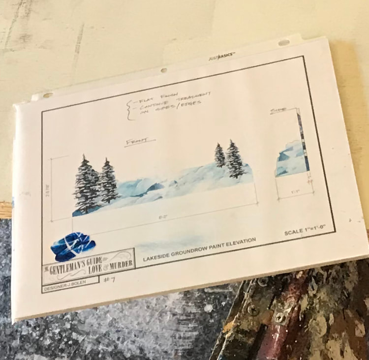
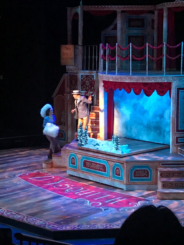
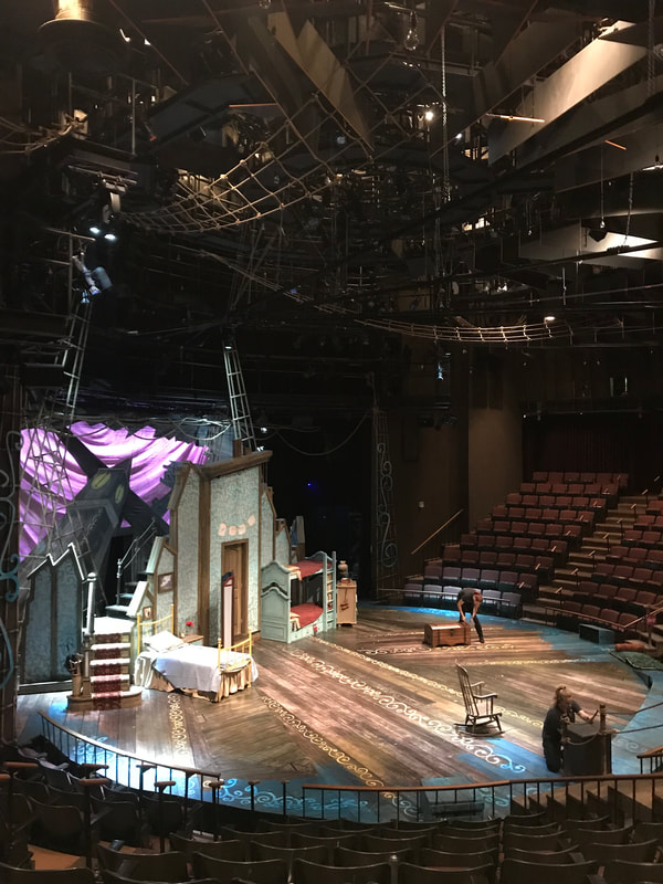
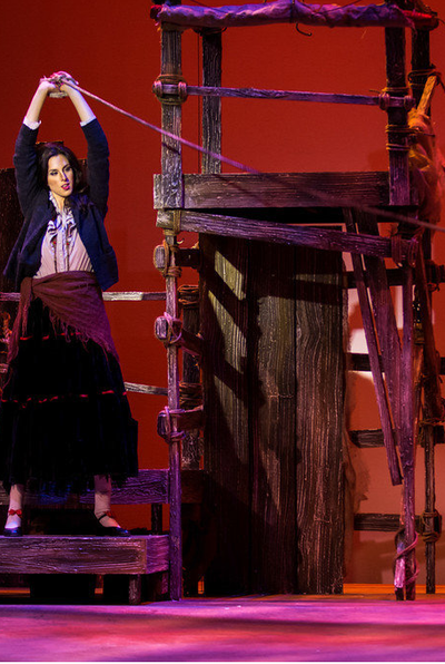
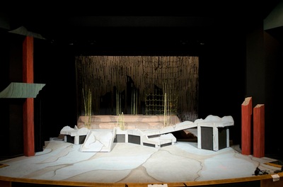
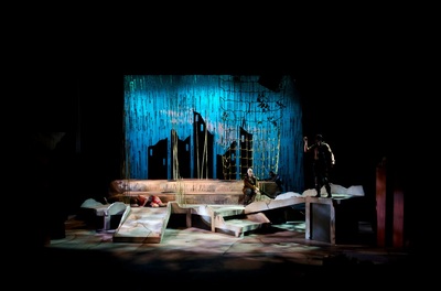
I painted this tree stand for the ice skating scene in A Gentlemans Guide to Love and Murder at the Pacific Conservatory Theatre. The lower left image is of the elevation provided.
Design by Jason Bolen
Lighting Design by Jennifer 'Z' Zornow
Costume Design by Eddy L Barrows
Design by Jason Bolen
Lighting Design by Jennifer 'Z' Zornow
Costume Design by Eddy L Barrows
A Gentlemans Guide to Love and Murder
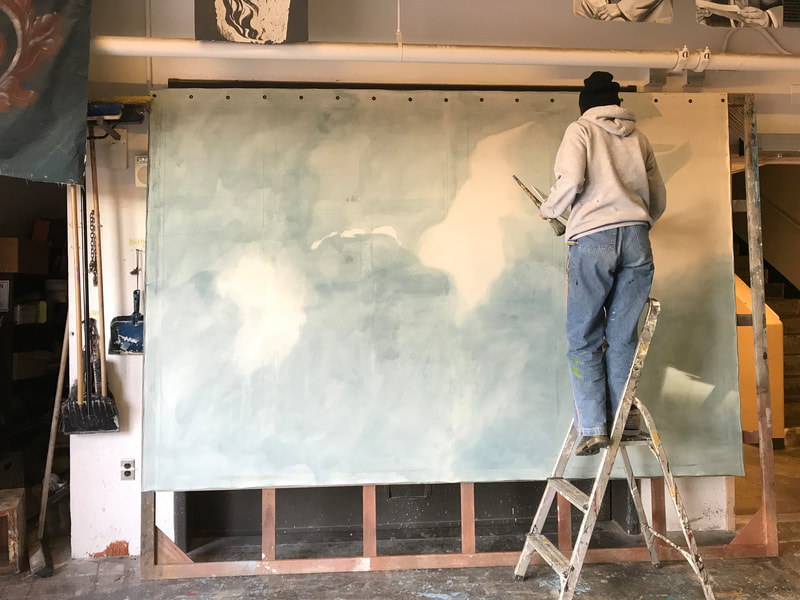
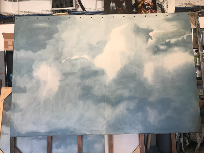
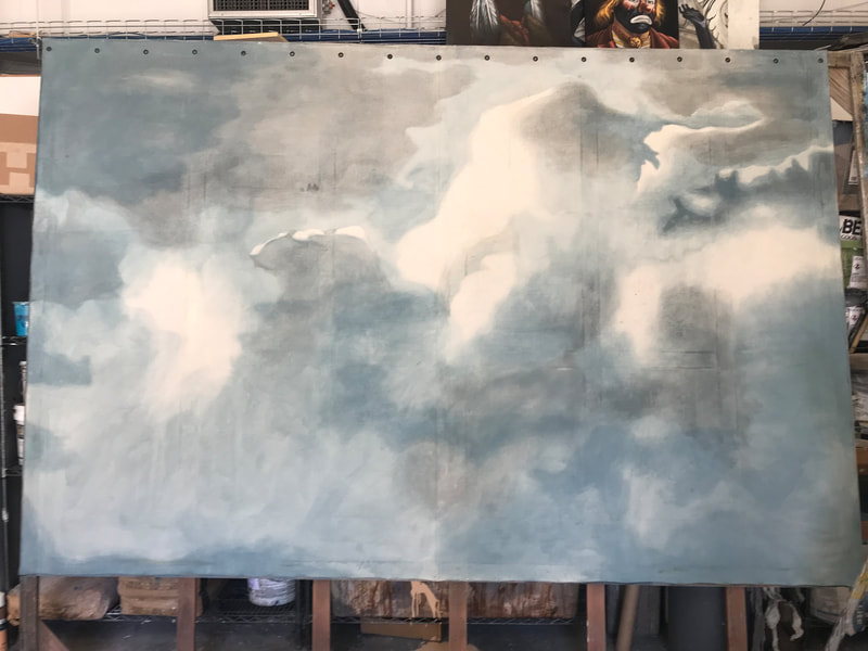
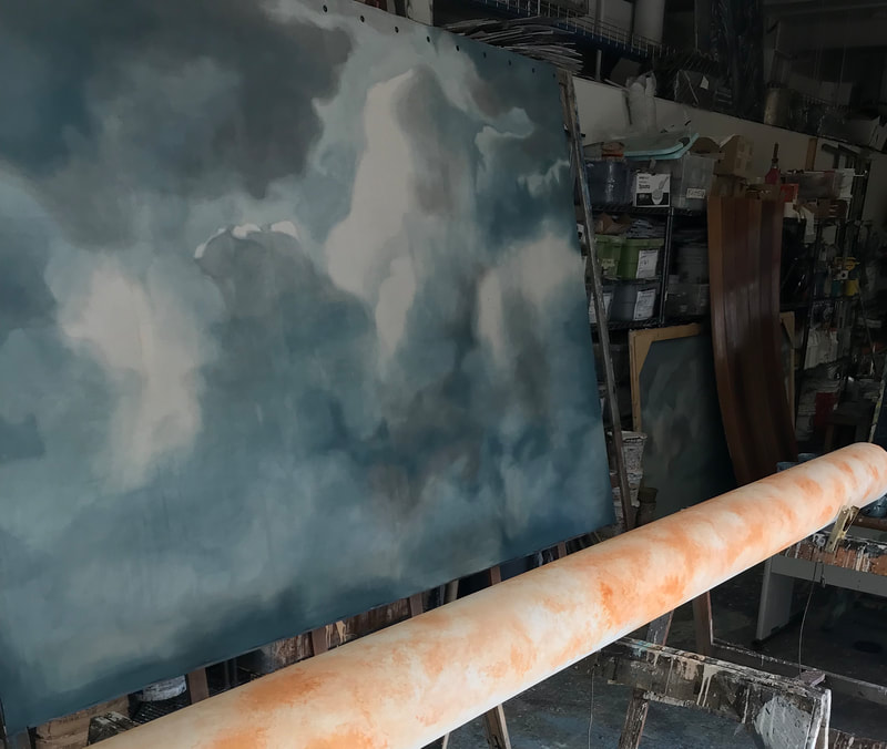
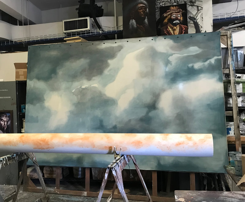
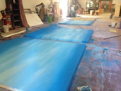
The progression of the cloud drop painted with blue and black washes of acrylic and water..
Scenic Design by Jason Bolen
Lighting Design by Jennifer 'Z' Zornow
Costume Design by Eddy L Barrows
The progression of the cloud drop painted with blue and black washes of acrylic and water..
Scenic Design by Jason Bolen
Lighting Design by Jennifer 'Z' Zornow
Costume Design by Eddy L Barrows
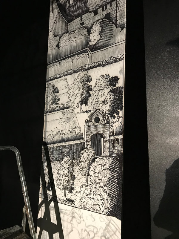
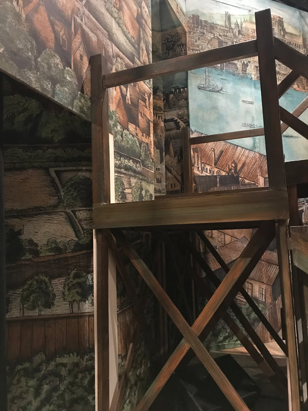
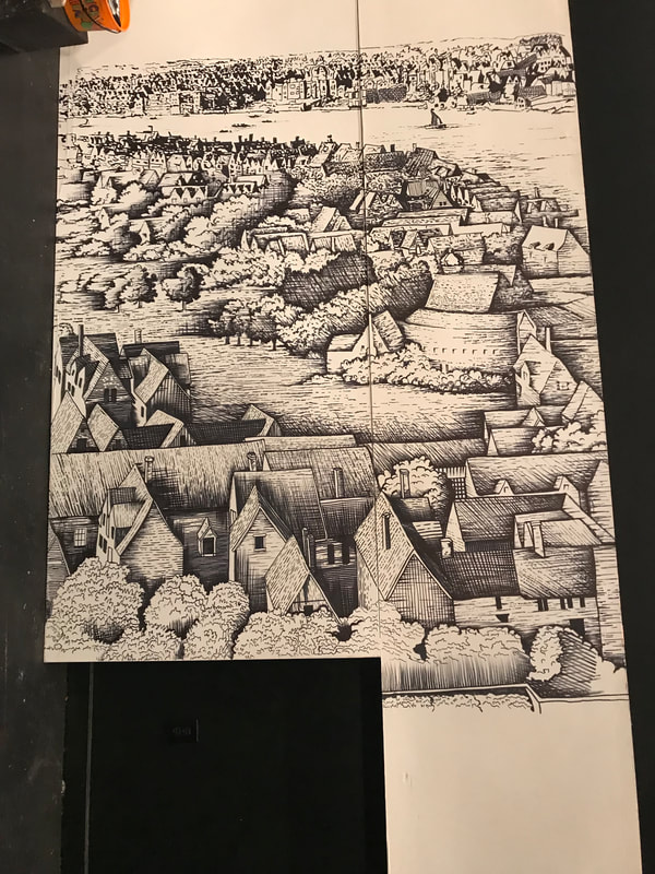
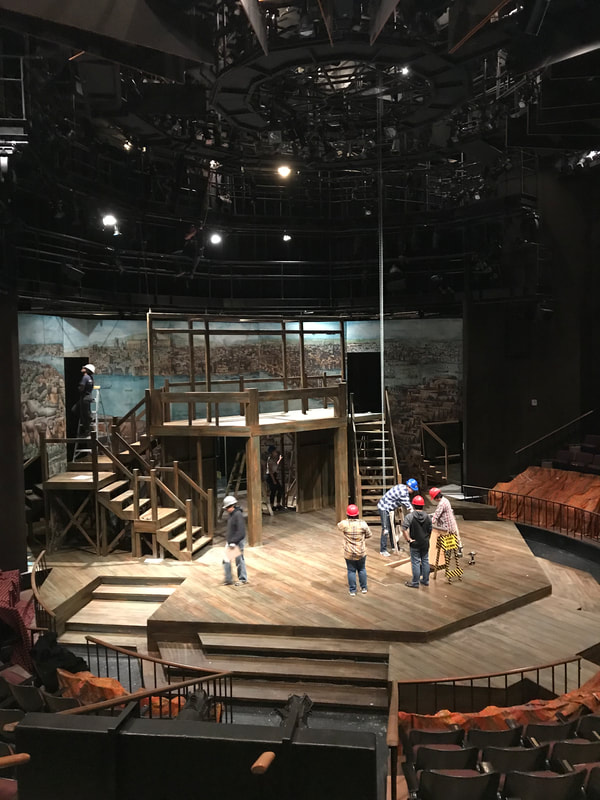
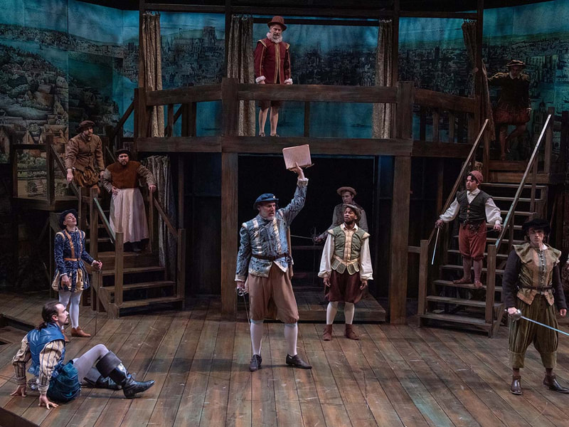
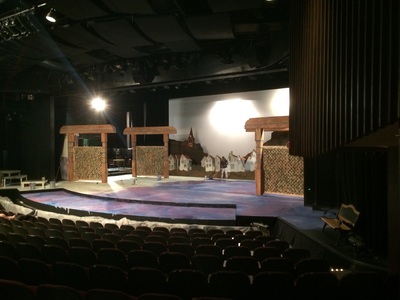
Muslin stretched and glued over large wooden frames formed a standing backdrop of flats depicting Wenceslas Hollars 1647 sketch for the set of Shakespeare in Love at the Pacific Conservatory Theatre. The image was printed on a series of transparencies to be projected onto the muslin and then traced over with large sharpies. Light washes of color were then added.
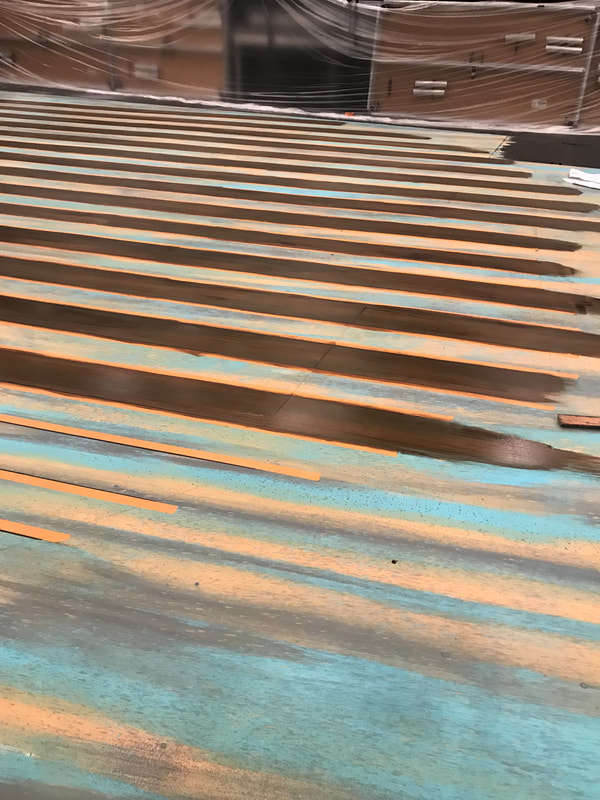
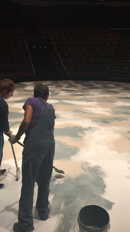
The floor was first painted a multicolored wet blend with a spatter drag over top of the same three colors. After a dark brown wood colored glaze was added the colors showed through as warm and cool tones.
Scenic Design by Abby Hogan
Lighting Design by Jennifer 'Z' Zornow
Costume Design by Sara Curran Ice
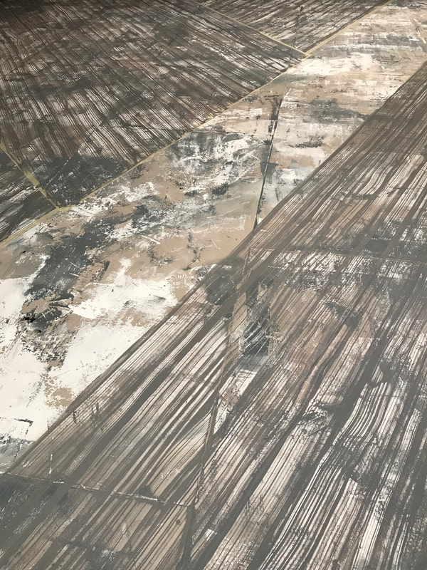
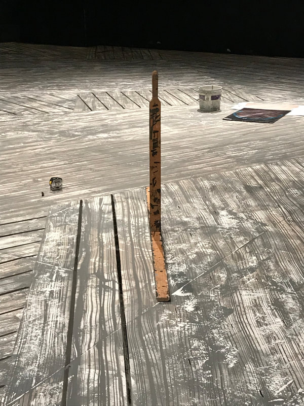
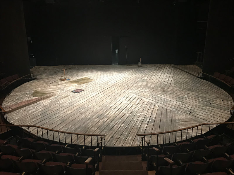
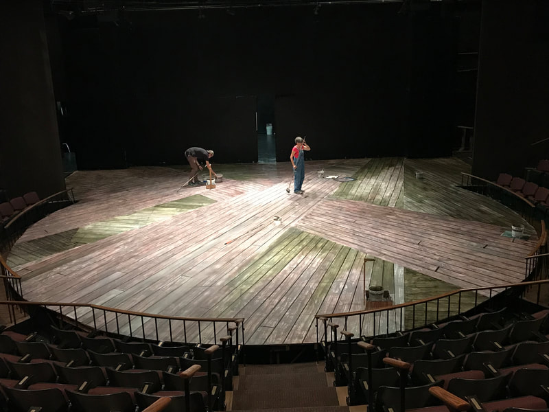
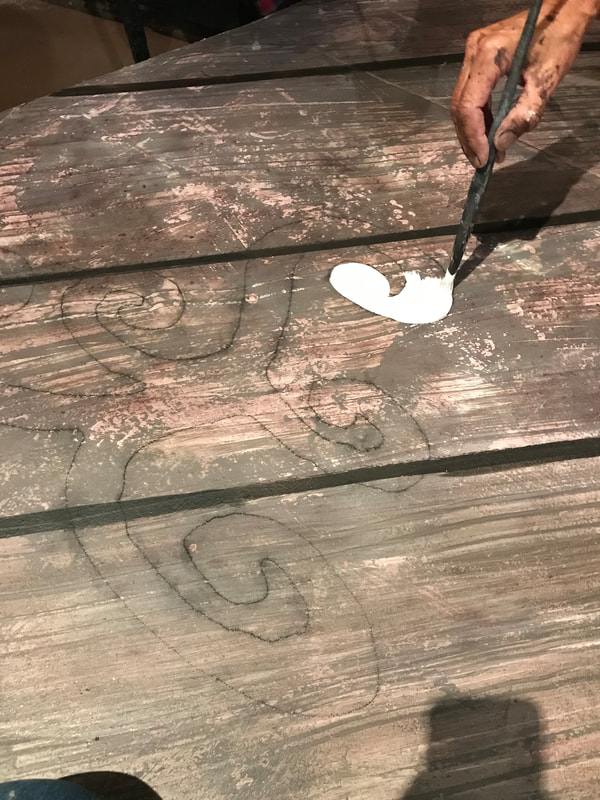
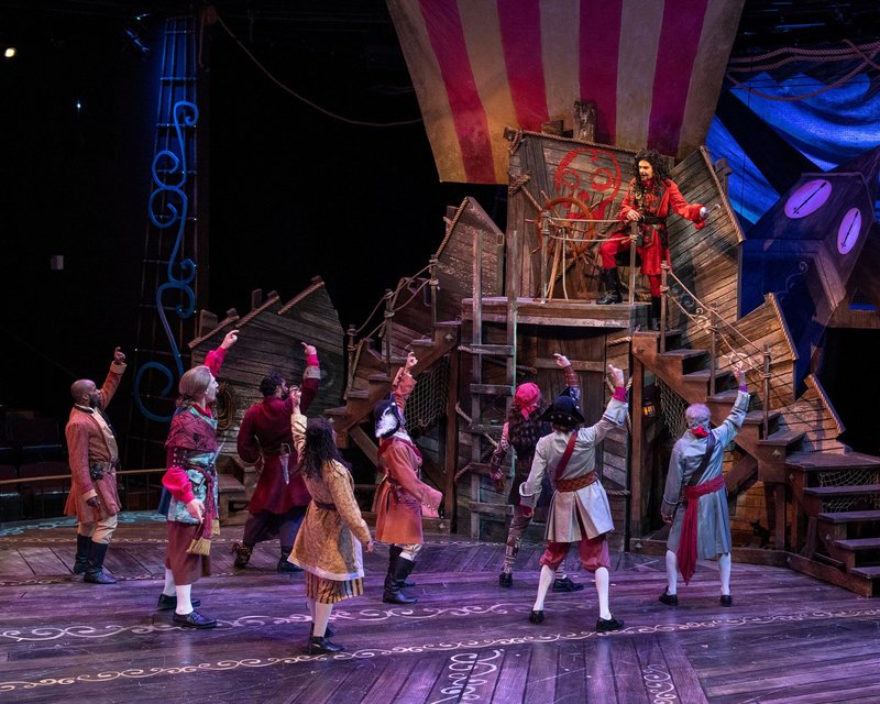
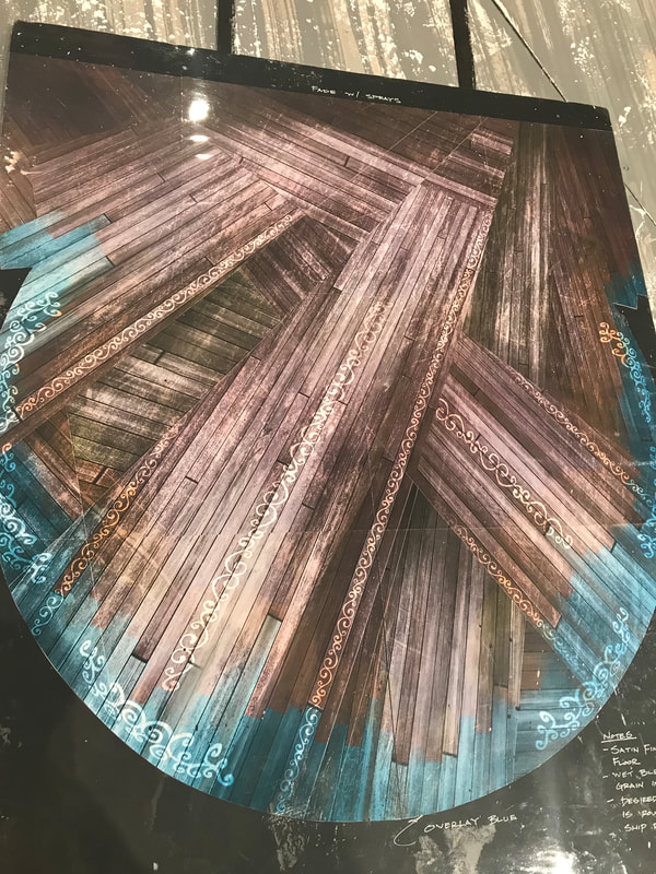
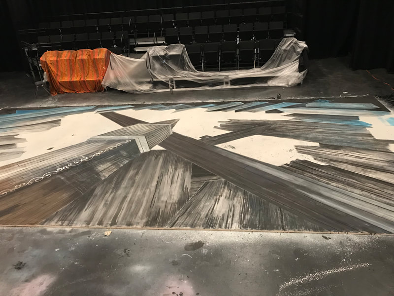
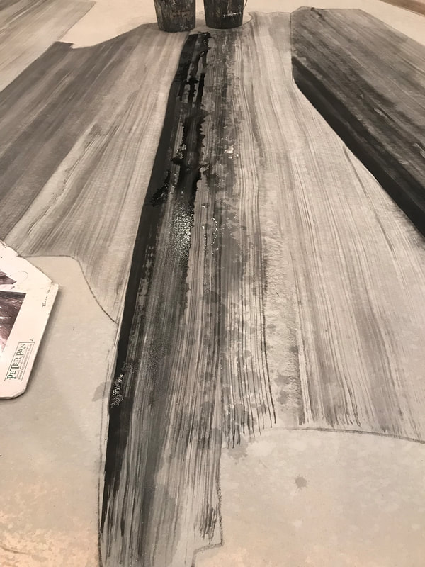
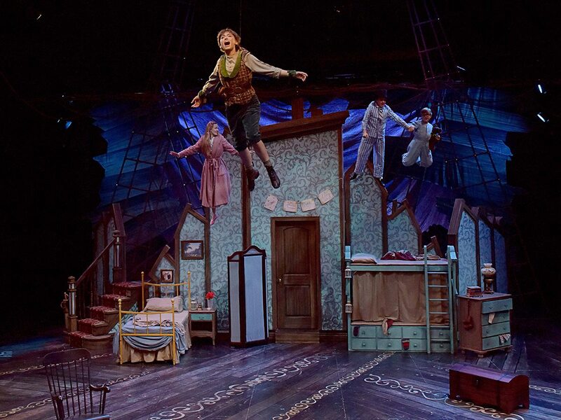
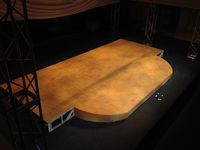
A thrust stage floor painted for the production of Peter Pan for PCPA (the pacific conservatory theatre). First we did a three color scumble. We then used wooden blocks to paint over the scumble with the same colors as seen in the top center image.. Then we added wood texture with wood graining tools and paint mixed with a glaze. We painted on plank lines using lining sticks, added washes of color on top, and then used stencils created from a pounce machine to add detail. The last image was a reference elevation provided by the designer Jason Bolen.
The lower center image includes walls painted mostly the same way as the floor with added joint compound underneath the paint treatments for texture eliminating the step of using wood graining tools.
Scenic Design by Jason Bolen.
Lighting Design by Jennifer 'Z' Zornow.
Costume Design by Eddy L Barrows
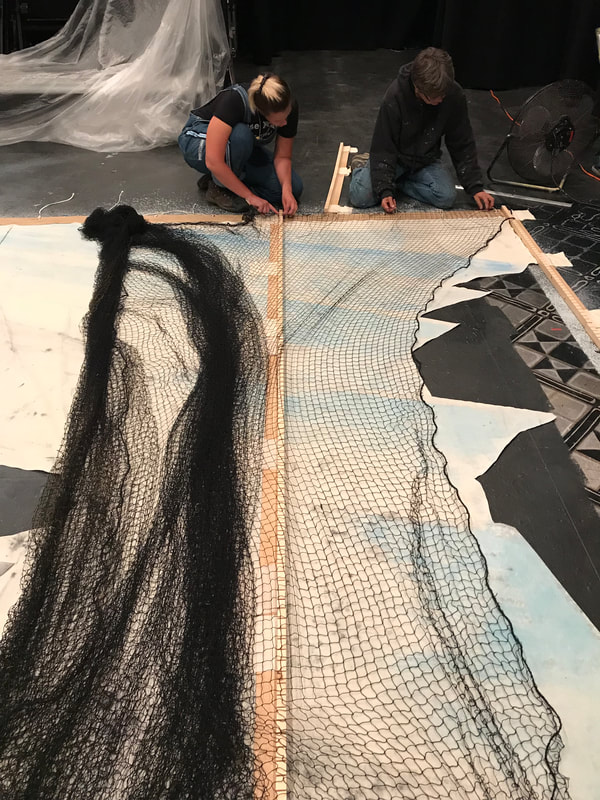
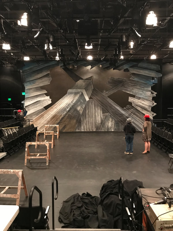
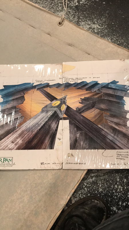
A cut drop with opera netting. for the production of Peter Pan at PCPA. Design by Jason Bolen. Cartooned and painted by myself and four others. The clock faces were later cut out of the drop with a light box added behind.
Scenic Design by Jason Bolen
Scenic Design by Jason Bolen
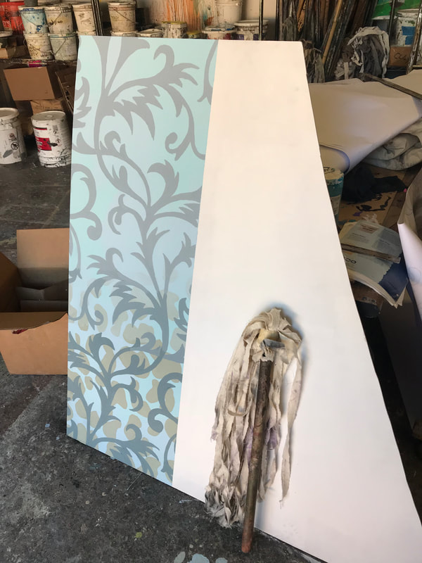
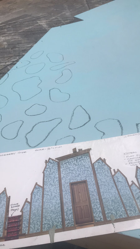
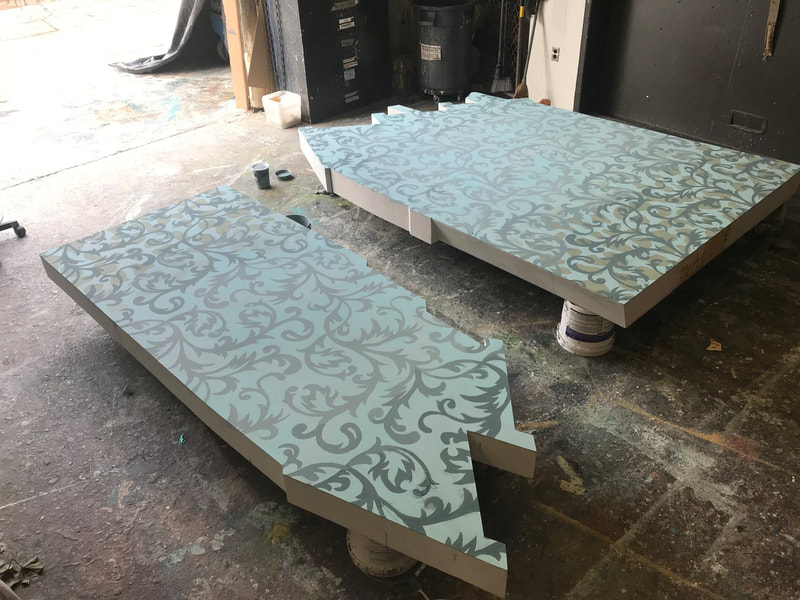
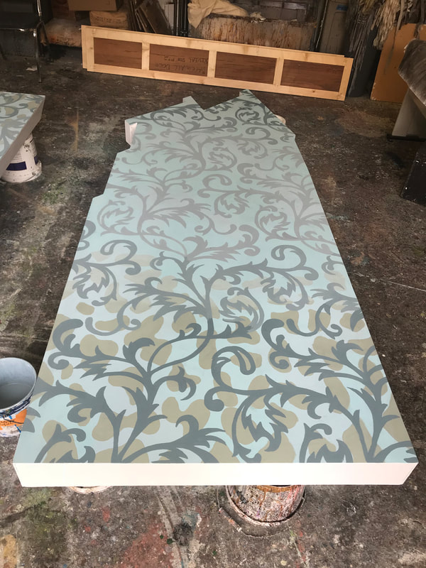
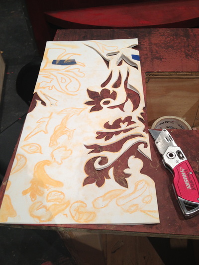
After using a pounce machine to cut the stencil for this wallpaper I created a sample piece by scumbling two colors, cartooning shapes, and then hand painting in the pounced design overtop. This was the wallpaper used in the production of Peter Pan at PCPA.
Scenic Design by Jason Bolen.
Lighting Design by Jennifer 'Z' Zornow.
Costume Design by Eddy L Barrows
Scenic Design by Jason Bolen.
Lighting Design by Jennifer 'Z' Zornow.
Costume Design by Eddy L Barrows
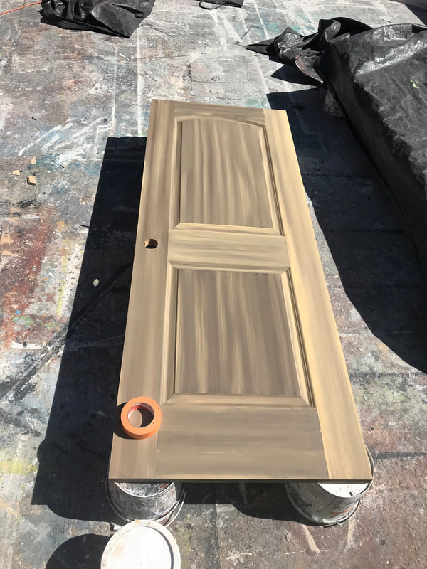
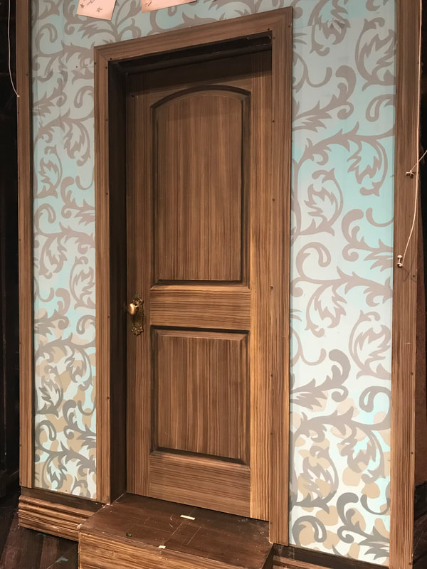
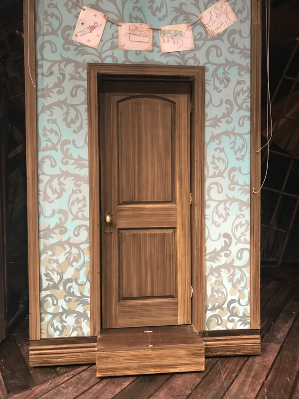
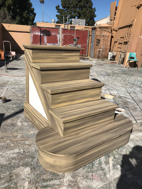
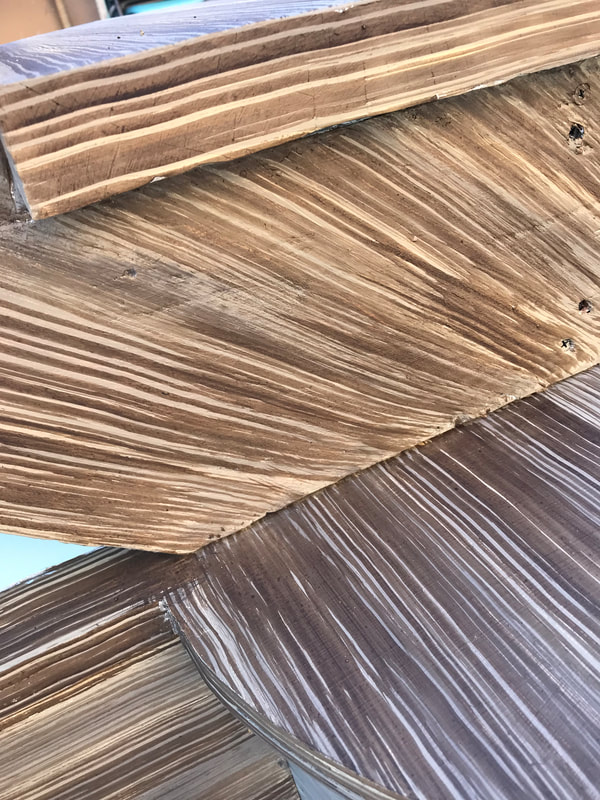
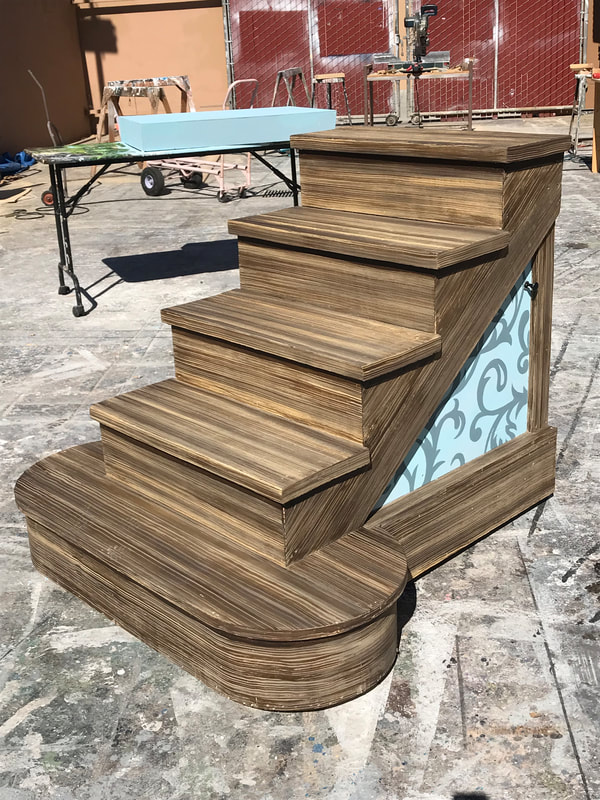
I painted this wet blend and straight grain on all molding, the door, and staircase..
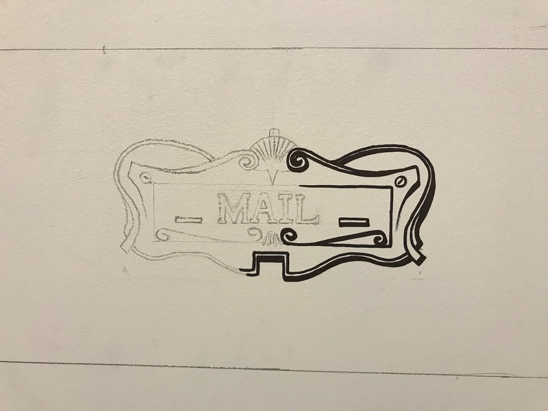
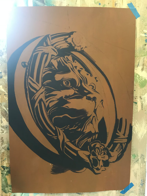
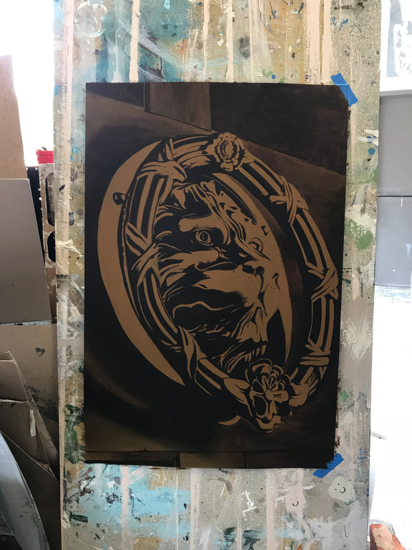
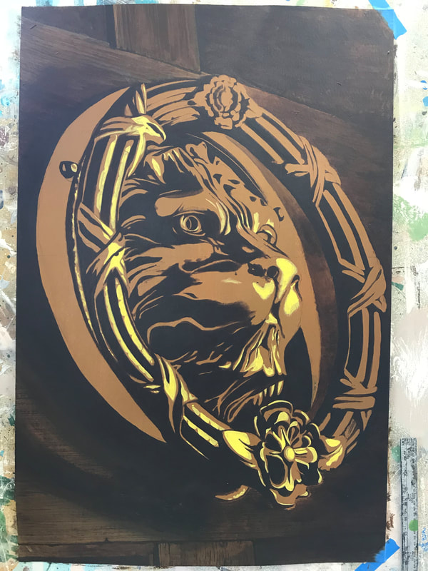
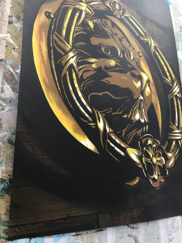
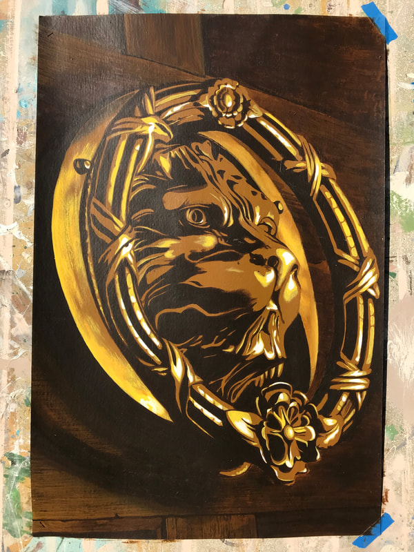
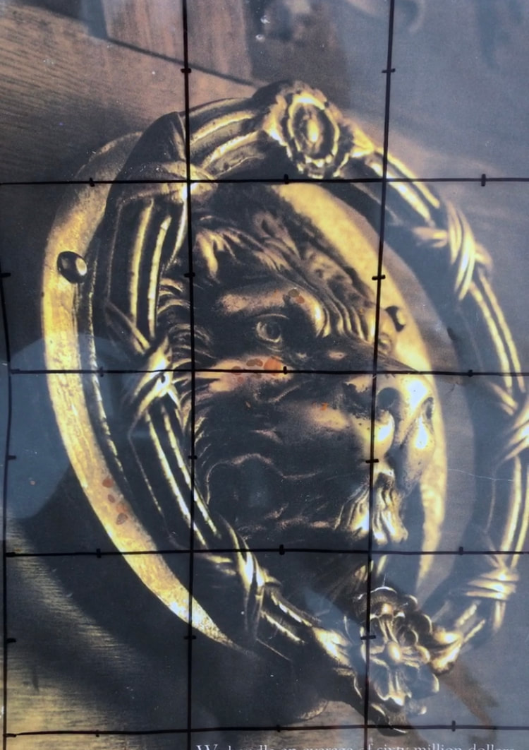
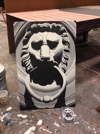
Trompe l'oeil lion door knocker. The last image is the reference photo.
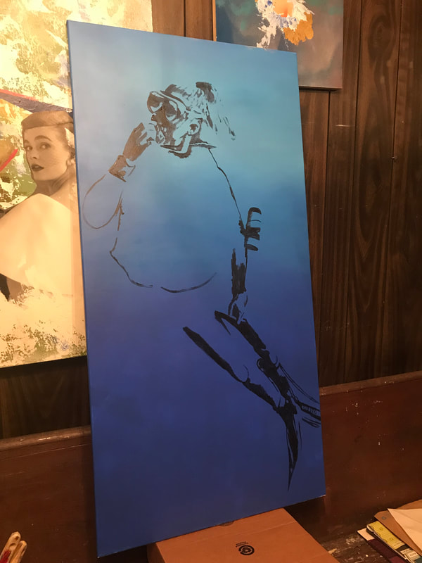
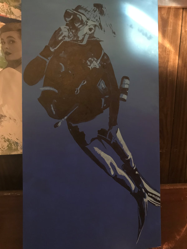
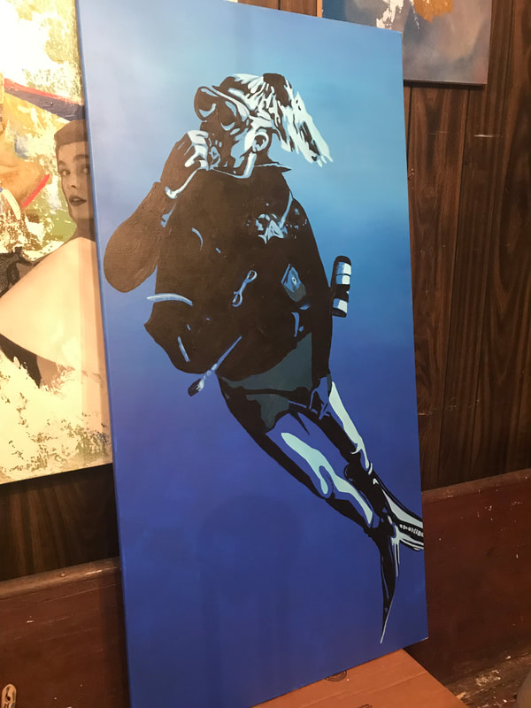
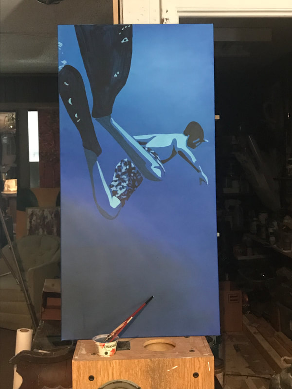
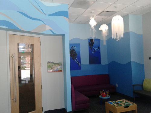
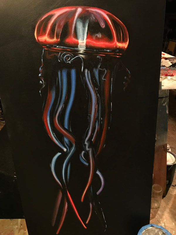
Waiting room at Jeffers Artman and Mann Pediatrics in west Cary NC.. Acrylic on canvas.
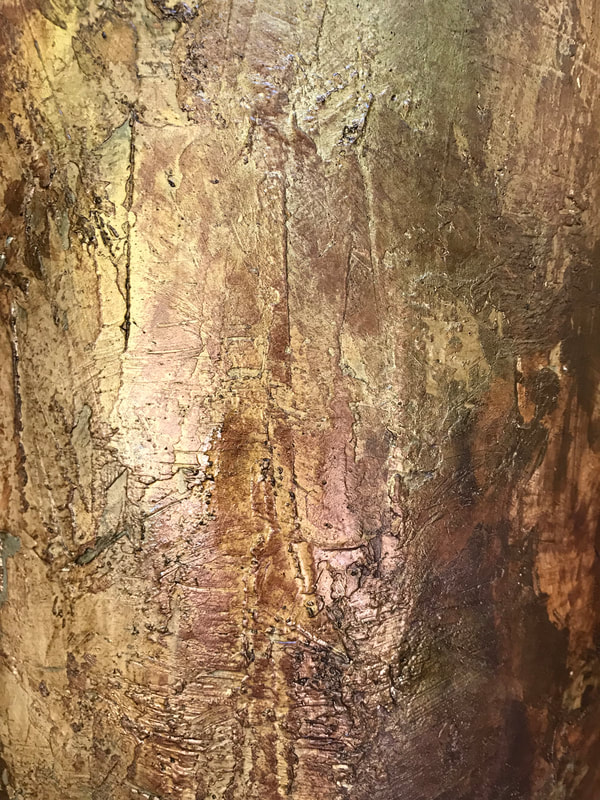
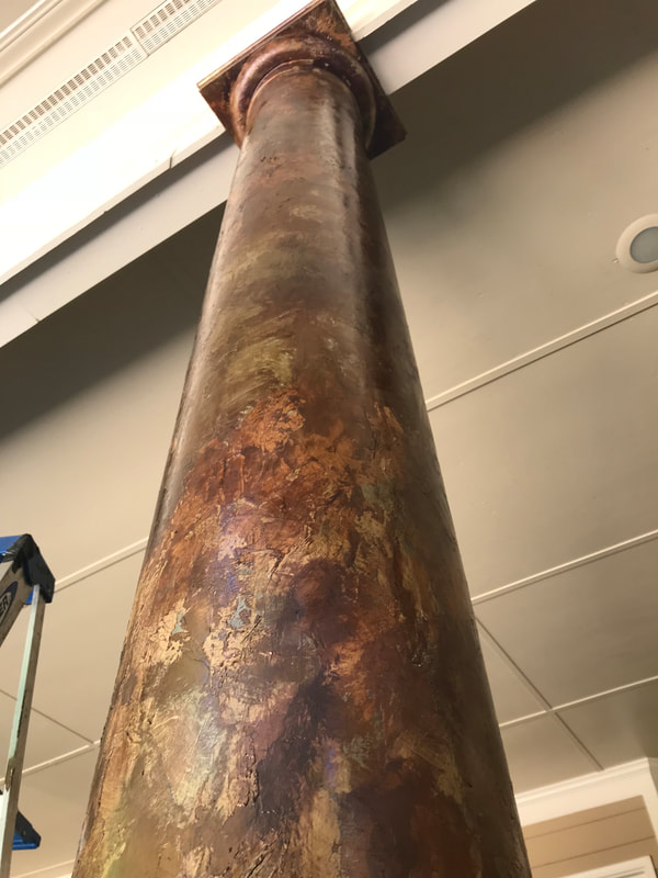
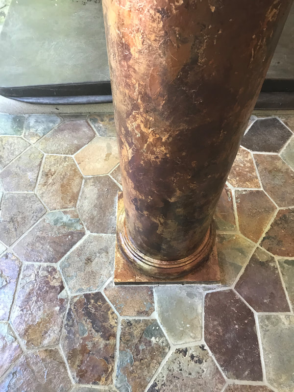
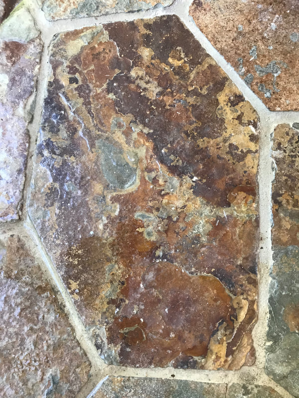
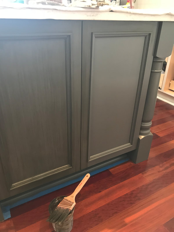
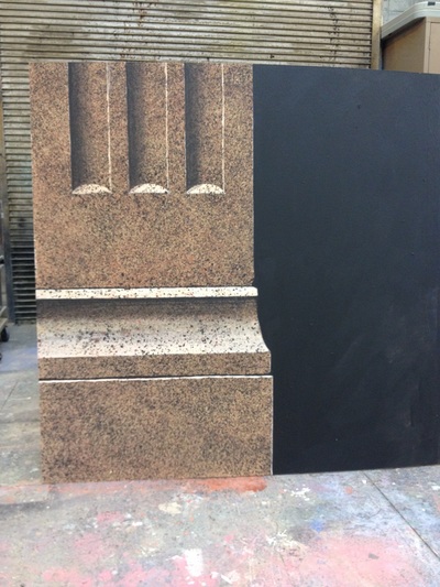
Several finishes painted for S.A. Johnson Decorative Arts and Interiors. The top images are of a plastered column textured and painted with metallics to look like the reference stone piece in the image bottom left for a home at Jordan Lake, NC. The lower center image is of a glaze grain being added over grey cabinetry. The bottom right image is of a column painted to appear as a light marble
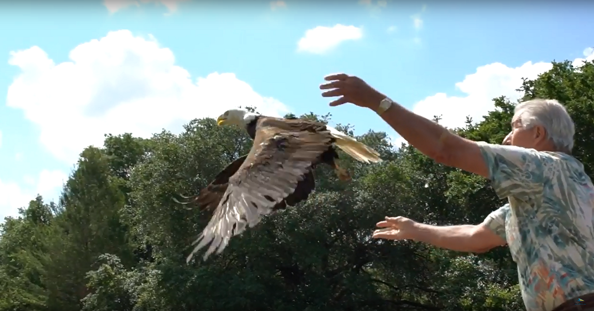
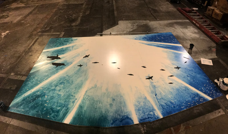
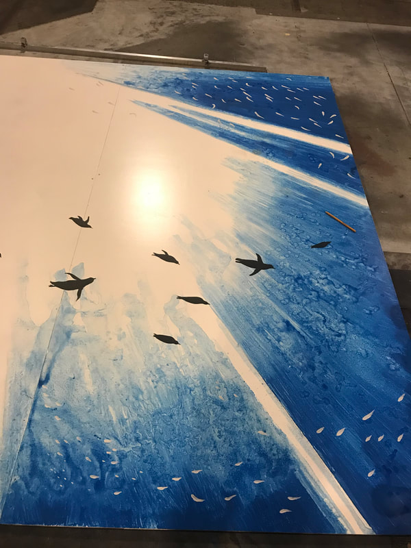
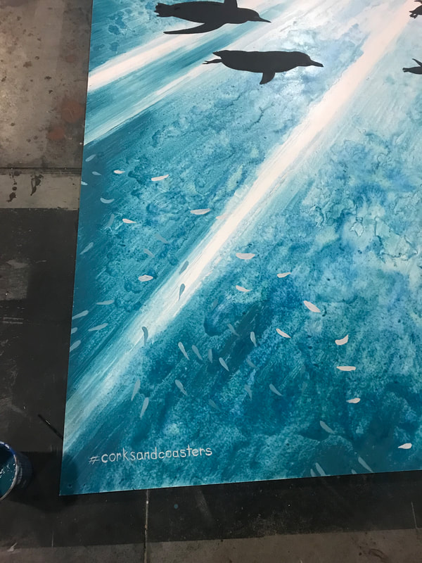
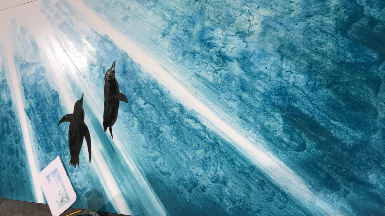
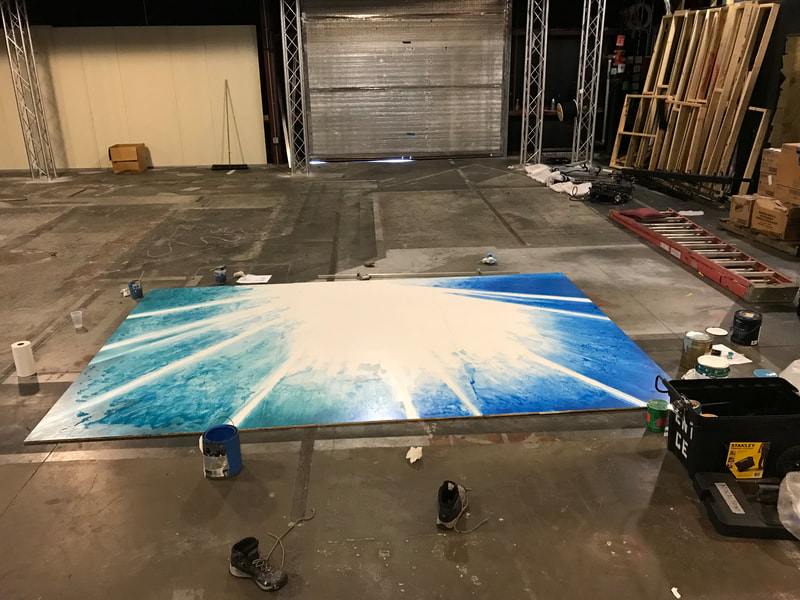
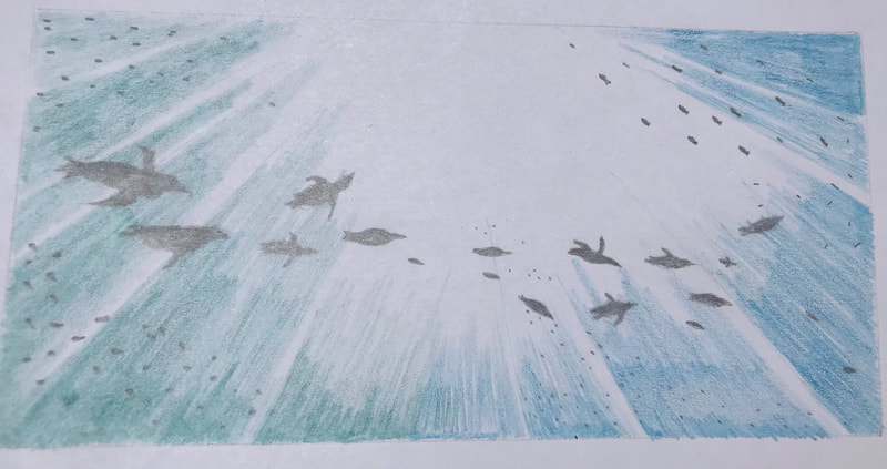
I designed and painted these two murals for the Food and Wine Festival at Busch Gardens Tampa. The first with the eagle took inspiration from an image of an eagle release done by Busch Gardens. The eagle had been hurt in a territorial dispute and was rehabilitated by the park. The second mural of penguins depicts african penguins, the type that live in the park.
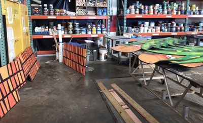
This is the shop and warehouse where scenic work is done for Busch Gardens Tampa. Much of the work I did here was touch ups to clean up scenery that had been out in the weather or in storage. Here you can see a few pieces laying out that I did color matching for to fix imperfections.
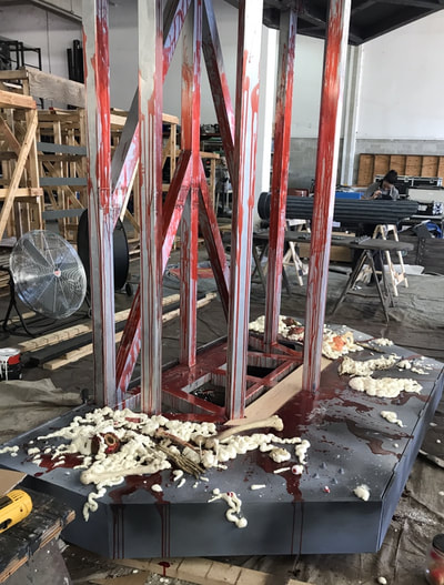
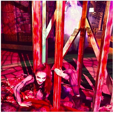
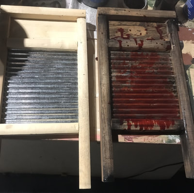
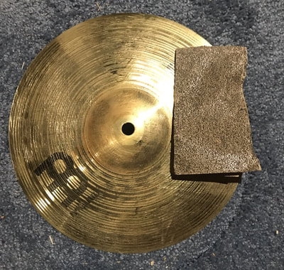
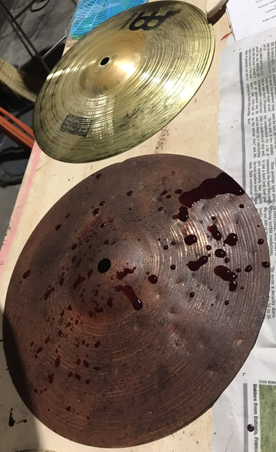
Bloodied Props I painted for Howl O Scream at Busch Gardens Tampa. Fake blood was made with breakthrough sealant and food dye.. "Guts" were added to the "blood cage" at top left using Great Stuff, prop bones and organs screwed down to the wood surface. I painted the bottom platform to look like steel by doing a scumble of different greys. The cymbols and washboards were painted for the haunted house Bayou. at Busch Gardens. The image of the washboards has one unpainted next to one that has been completed. The symbols were made to look rusty and bloody with the fake blood mentioned above after sanding them down and spray painting them. Some latex paint was sponged on top.
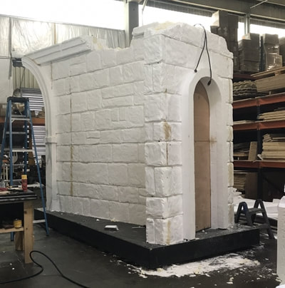
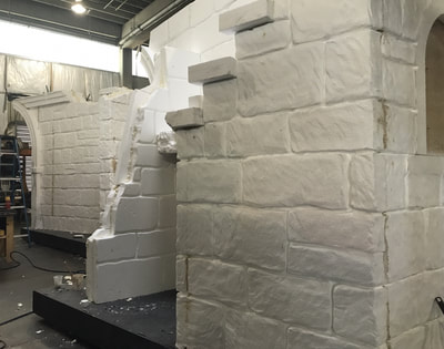
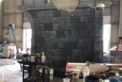
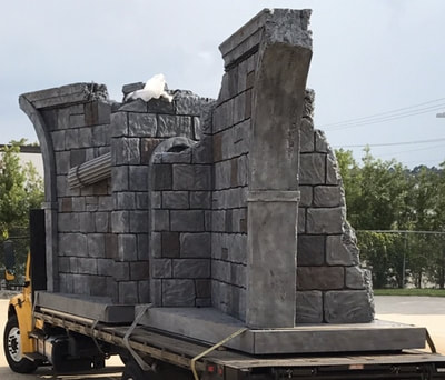
Foam carving and painting done for Howl-O-Scream at Busch Gardens Tampa. The large sheets of foam were put together by carpenters. I helped a couple others carve out the individual stones and paint them. Several different colors were used for different stones which were painted solid with shading dry brushed on top.
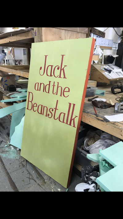
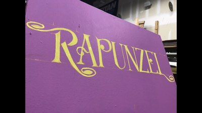
Lettering and sponging done for the production of Into the Woods JR. at the Jenny Wiley Theatre as their summer scenic charge artist.
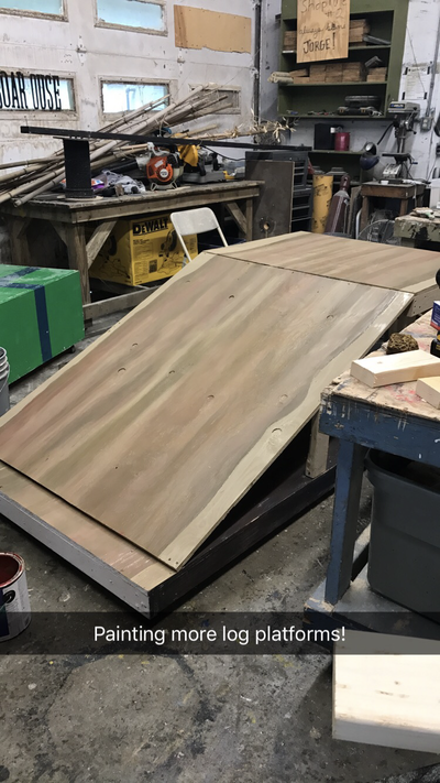
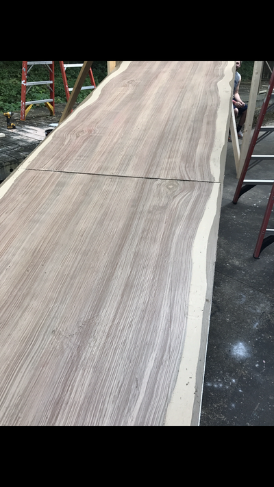
Wooden platforms painted for Tarzan at the Jenny Wiley Theatre.. First I painted the edges the solid beige, then did a wet blend of wood tones. Last I painted two shaded of grain.
Grout sponging and stencil cut on the repeat to fit together on all sides. Madagascar Jenny Wiley Theatre
Scenic Design by Darryl Willard
Scenic Design by Darryl Willard
Lettering for the production of Madagascar at the Jenny Wiley Theatre.
Scenic Design by Darryl Willard
Scenic Design by Darryl Willard
For the Jenny Wiley Theatre the scenery was all painted to look like steal. Dry brushing and sponging was done to create create this look.
Scenic Design by Darryl Willard
Scenic Design by Darryl Willard
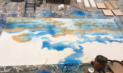
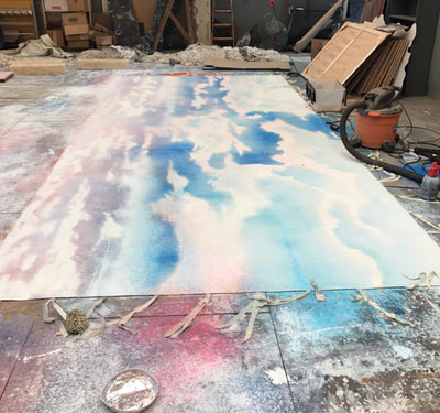
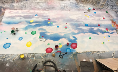
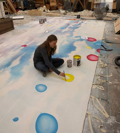
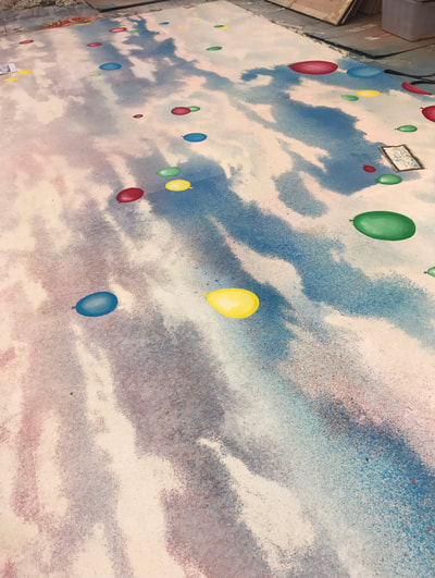
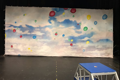
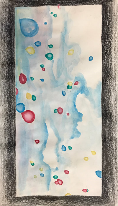
I designed and painted this drop the the show Go Dog Go! at the University of North Carolina at Greensboro. Before spaying the blue I used sawdust as a frisket to mask the clouds.I used sprayers to paint the drop except for the balloons which I painted on with a brush. The last image is a watercolor rendering I did before beginning the drop.
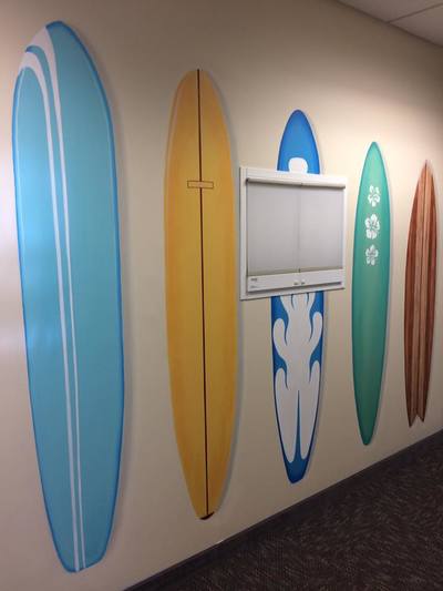
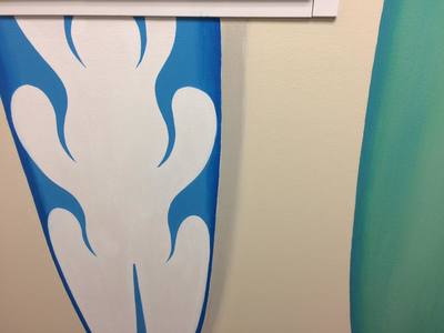
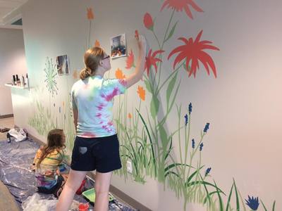
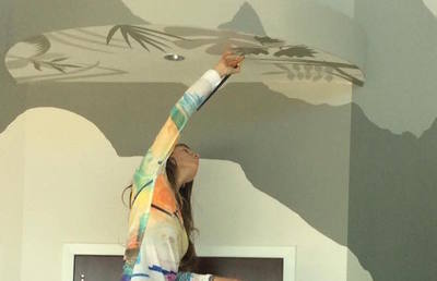
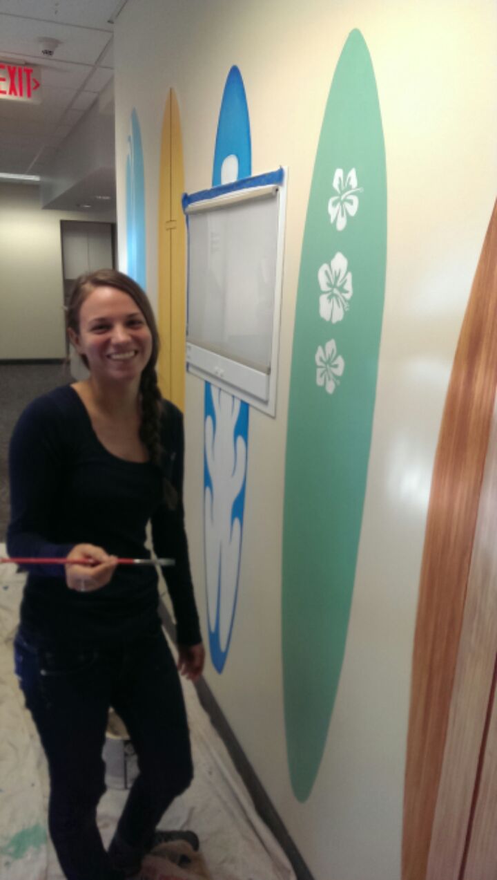
Murals painted with S.A. Johnson Decorative Arts and Interiors. These murals were done in two separate pediatrician offices with one theme being outdoors and the other being a beach. Surfboards were done by me, the other two were collaborative..
Design by Sven Johnson
Design by Sven Johnson
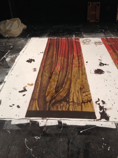
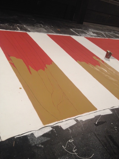
I volunteered to paint this cut drop for a fashion show run by students attending The University of North Carolina at Greensboro. I painted the drop using a brush attached to a bamboo stick while standing. I used the grid method to accurately draw a small image of a curtain I was provided at a much larger scale.
All images above are of scenic painting class work at UNC Greensboro other than the stage floor. All of the above were painted on a two demential surface. The floor was painted a blue and purple scumble with mops for the show Pippi Longstocking at UNC Greensboro.
Scenic Design of Pippi Longstocking by Amanda Warriner
Scenic Design and Painting classes taught by Randall McMullen, DeDe Farrell, and Lauren Reinhartsen
Scenic Design of Pippi Longstocking by Amanda Warriner
Scenic Design and Painting classes taught by Randall McMullen, DeDe Farrell, and Lauren Reinhartsen
For Smokey Joe's Cafe at STAGES St. Louis I was able to paint a large piece of skrim. I was careful the paint didn't stick in the holes of the fabric and then added a stencil pattern on top with the help of three others. The same stenciled pattern was painted on the floor.
Scenic Design by James Wolk
Lighting Design by Matthew F McCarthy
Costume Design by Brad Musgrove
Scenic Design by James Wolk
Lighting Design by Matthew F McCarthy
Costume Design by Brad Musgrove
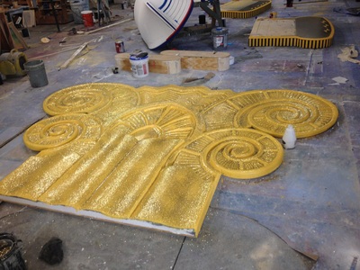
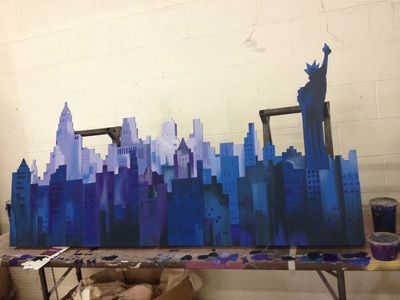
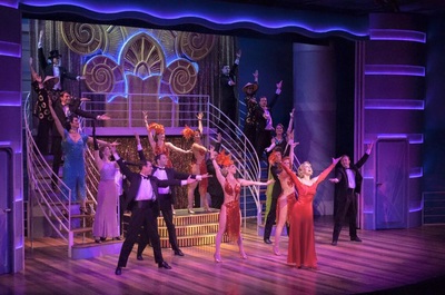
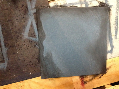
For the show Anything Goes at STAGES St. Louis I was able to do some foam carving along with painting. I was able to practice on a small piece of foam before making the larger piece with the help of the Props Master. The City was painted by me. I painted the sky with the help of one other painter. I used a pneumatic cup gun sprayer for the sky. The floor was painted to appear as wood by four painters including me
Scenic Design by James Wolk
Lighting Design by Sean Savoi
Costume Design by Brad Musgrove.
Scenic Design by James Wolk
Lighting Design by Sean Savoi
Costume Design by Brad Musgrove.
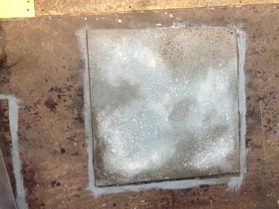
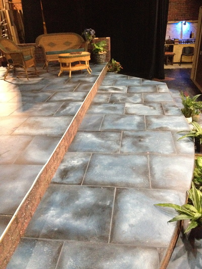
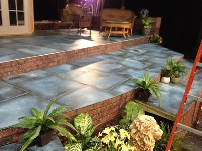
I painted these outdoor stone tiles for Raleigh Little Theaters production of Much Ado about Nothing. I painted the tile a grey blue color and sprayed it with some water. I then blended the shadows and highlights. The sprayed water left a slight grit texture as the lights and darks were blended. A layer of polycrylic was added for protection after the paint dried.
Scenic Design by Elizabeth Newton
Scenic Design by Elizabeth Newton
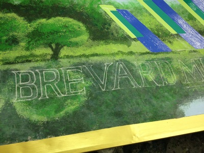
This is the stage left panel of the hard drop painted for Brevard Music Centers production of Don Giovanni. I first used chalk to draw out the clouds and then using a plank to walk on painted them in.
Scenic Design by Evan Adamson
Scenic Design by Evan Adamson
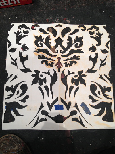
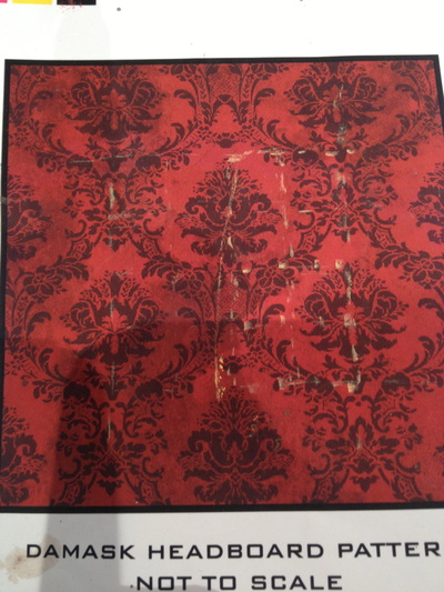
I made this damask stencil during one of our all nighters and was pushed for time. I had to simplify the example provided by our designer, Evan Adamson. I found the repeat and marked it with the dotted chalk lines. I folded the paper in half and drew half the design so after being unfolded both sides were left identical. .
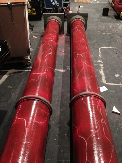
Another painter helped me learn the marbling for the columns. She came up with the technique and taught me. My column is the one on the left. This was my first experience with painting a marble texture. We first did a scumble of reds followed by painting on the light lines with a goose feather giving width variation to the lines. We then added some red sponging to fade out edges and ends of the lines. A layer of polycrylic was added as well.
Scenic Design by Evan Adamson
Scenic Design by Evan Adamson
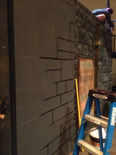
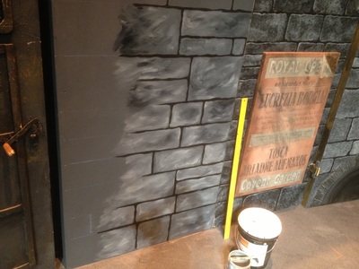
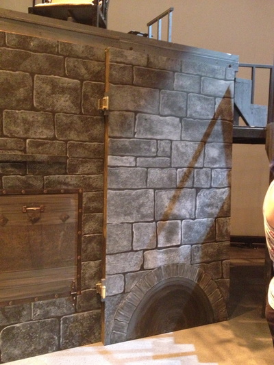
Stone walls painted for Sweeney Todd at the Brevard Music Center.
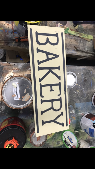
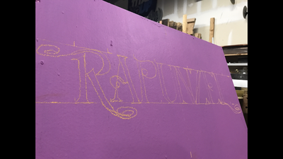
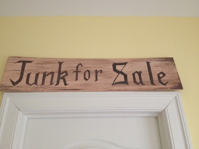
Hand lettering for Sweeney Todd, Speed Dating Tonight, Oliver!, and a sign to hang in the BMC box office. No stencils or projectors were used for any of these. For the Junk sign I was only given the example "knives to grind" in the font that the designer wanted and I designed the look of the other letters to match.
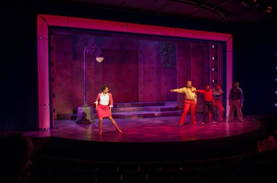
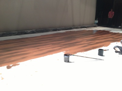
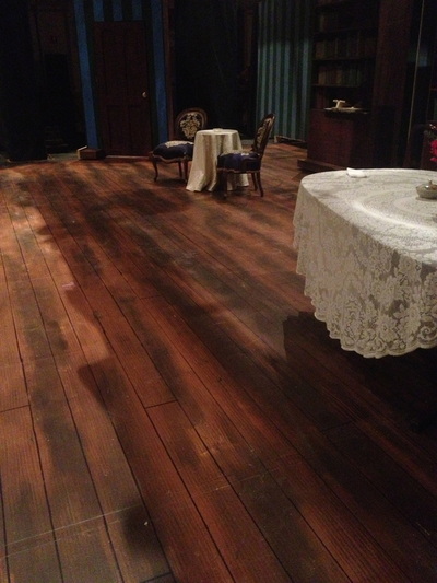
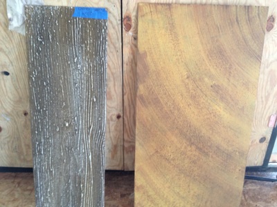
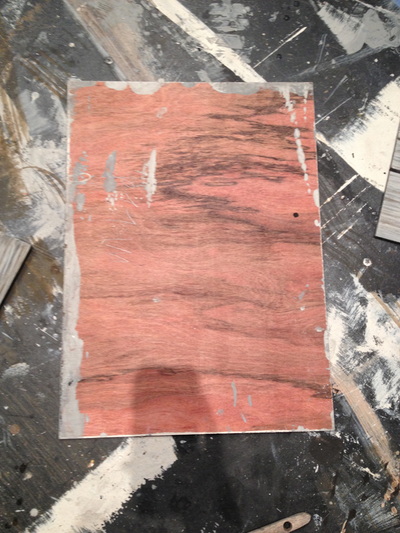
These are some of my favorite wood grains that i've been able to do. For the production of La Tragédie de Carmen, me and three other artists used joint compound raked with wire brushes to create a 3d wood grain effect before painting on the wet blend and going over the dried paint with some sandpaper to help show the texture.. For a production of Falstaff, the entire set was a grey scale, so we did grey toned wood. The dark wood floor is one that was done overnight for Albert Herring by painting a wet blend of two colors and adding combing and the dark lines for the spaces between the panels. On the thin piece that is part of a supertitle screen looking similar to the floor, the same technique was used. For the raked stage of La Tragédie de Carmen we were asked to paint something that could be a wood floor and also a bull fighting ring pit floor. We did a scumble of sand and wood tones and then did some combing followed by a spatter drag to give it a grittier texture.
Scenic Design by Danielle Schultz
Lighting Design by Kelley Finn
Costume Design by Glenn Avery Breed
Scenic Design by Danielle Schultz
Lighting Design by Kelley Finn
Costume Design by Glenn Avery Breed
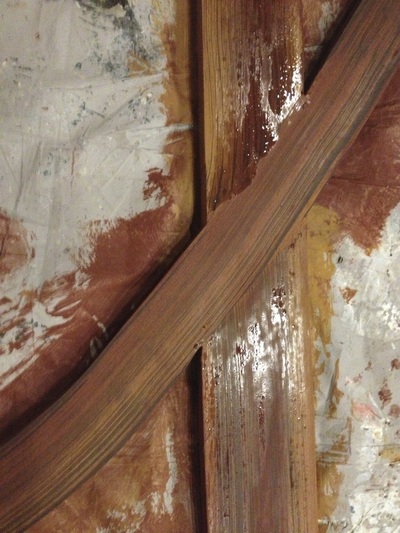
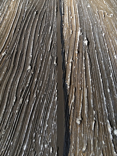
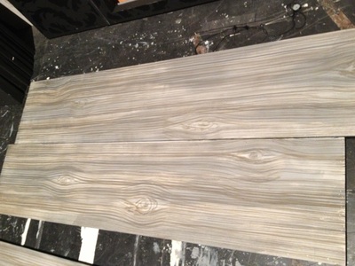
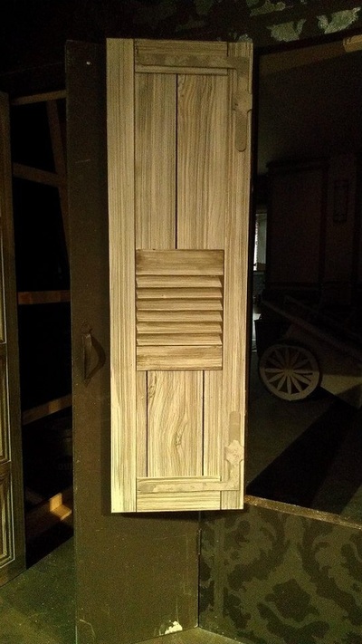
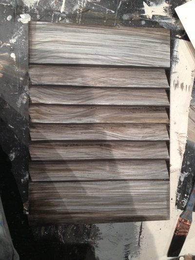
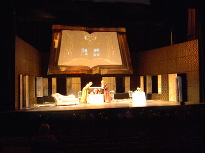
Here is some trompe l'oeil I did for Falstaff at Brevard. The first two pictures are a before and after example of the grey wood grain shutters I did. Two other artists and I also got to paint the outside of a giant book that was used as a border for a projection screen. I did the old leather look around the edges as well as the crinkled paper bookmark.. The pages and other bookmarks were not painted by me.
Scenic Design by Evan Adamson
Lighting Design by Tláloc Miguel López-Watermann
Costume Design by Glenn Avery Breed
Scenic Design by Evan Adamson
Lighting Design by Tláloc Miguel López-Watermann
Costume Design by Glenn Avery Breed
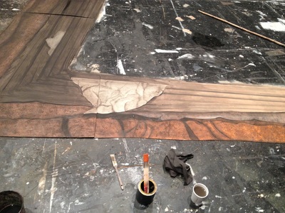
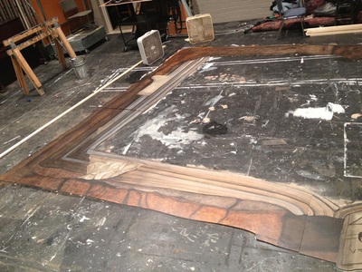
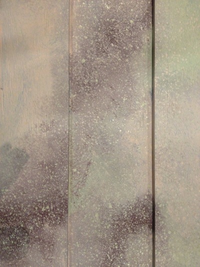
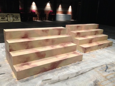
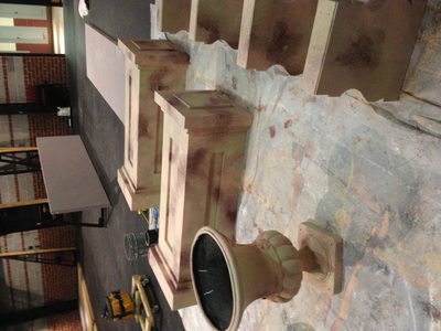
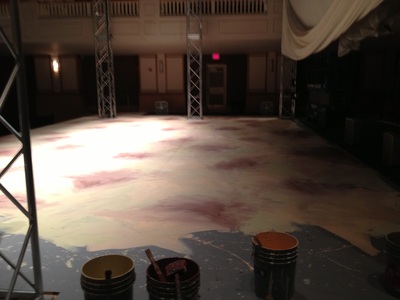
This marble scumble covered all floor surfaces and several other items in the production of The Merry Widow at the Brevard Music Center. The pictures of the stairs and stage floor are process shots.
Scenic Design by Danielle Schultz
Scenic Design by Danielle Schultz
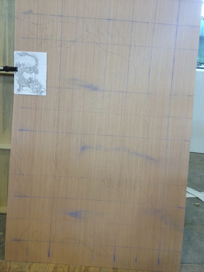
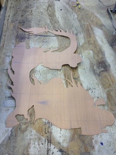
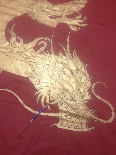
This is the china drop I did for Western Carolina Universities production of The Drowsy Chaperone. I drew out the dragon, and cut it out with a jigsaw to use it as a stencil. This made the two dragons the same size. I then went in with a sharpie to draw in the details.
Scenic Design by Alex K
Scenic Design by Alex K
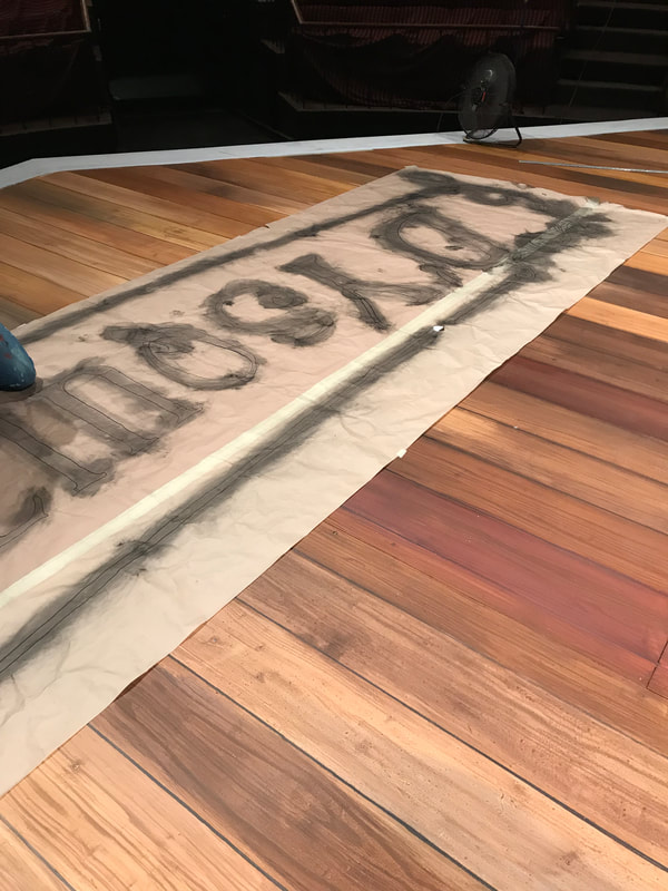
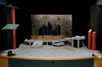
I painted this floor at Western Carolina for the show Rashomon with the help of our shop manager and designer, Alex K.
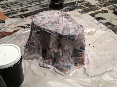
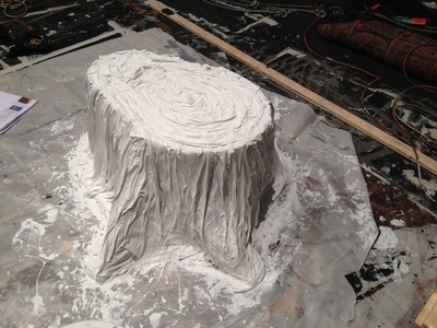
This stump was made by doing a paper mache over chicken wire and then adding torn muslin to make the bark and ring textures.
